© Jiyoun Kim Studio™ all rights reserved.
- Contact us
- info@jiyounkim.com
© Jiyoun Kim Studio™ all rights reserved.
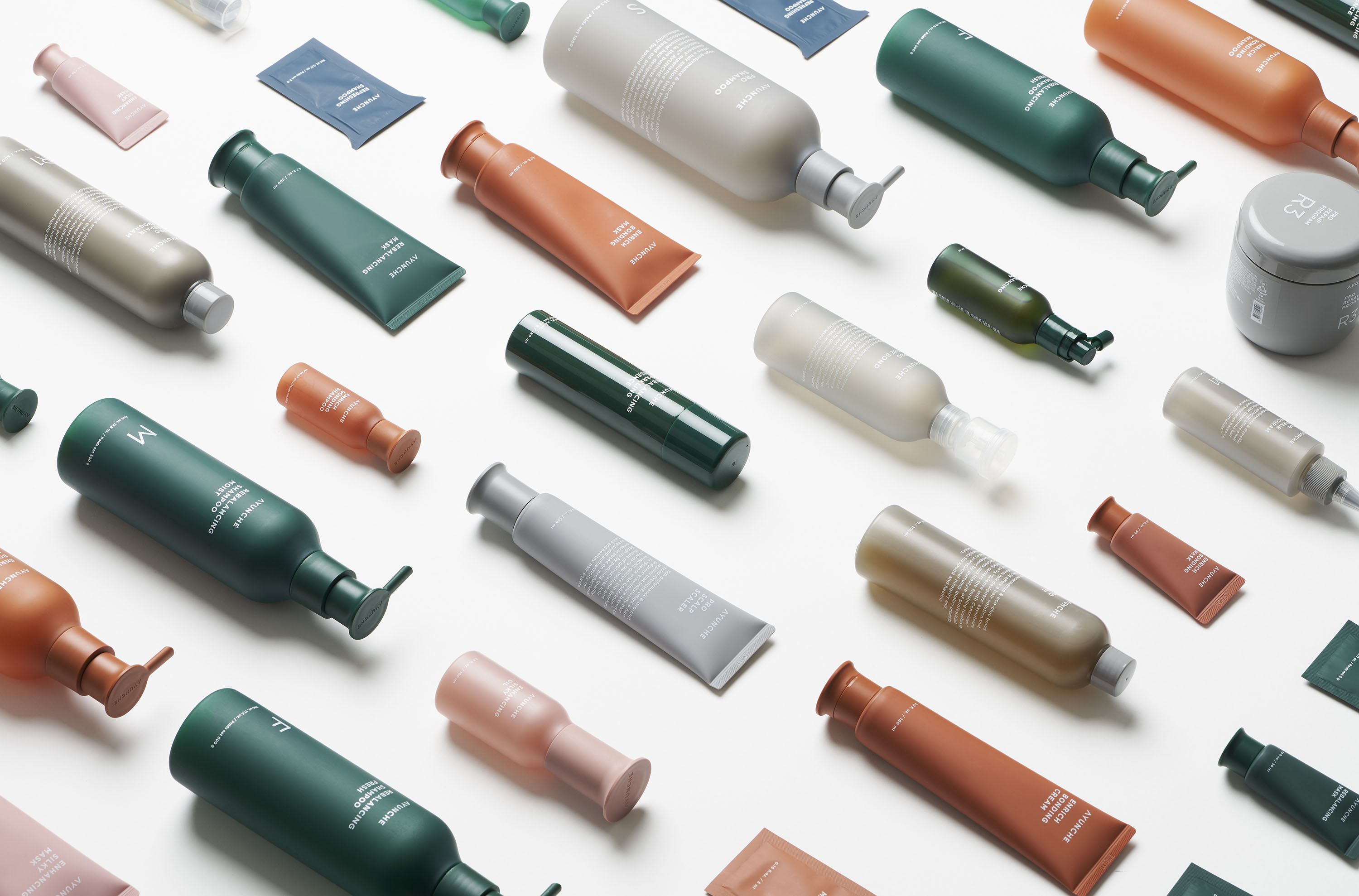
Ayunche Brand Refreshment
-
Year
2021
-
Role
- Strategy, Object
-
Client
Amos Professional
-
Designer
- Jiyoun Kim
- Hannah Lee
- Dokyoung Lee
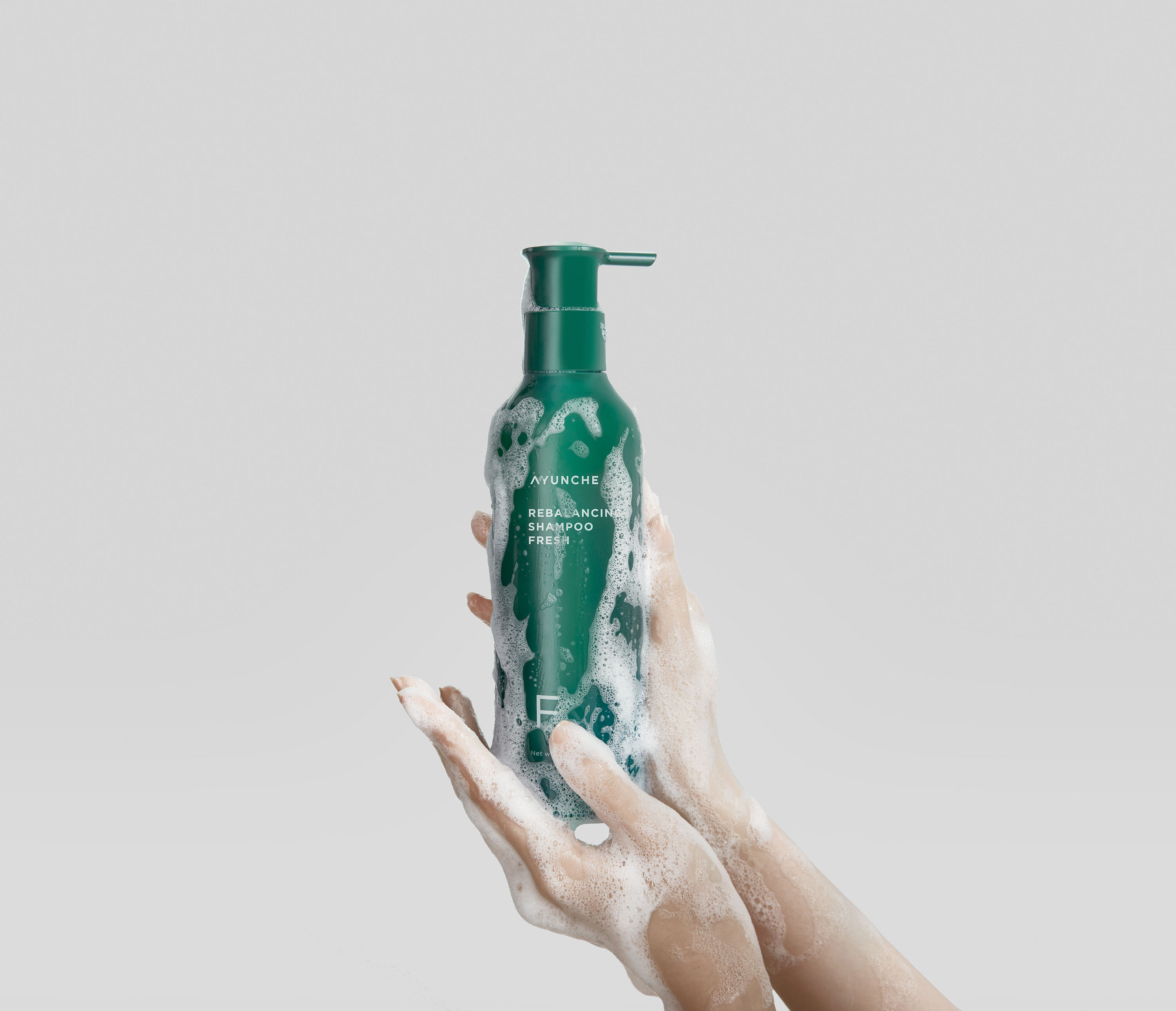
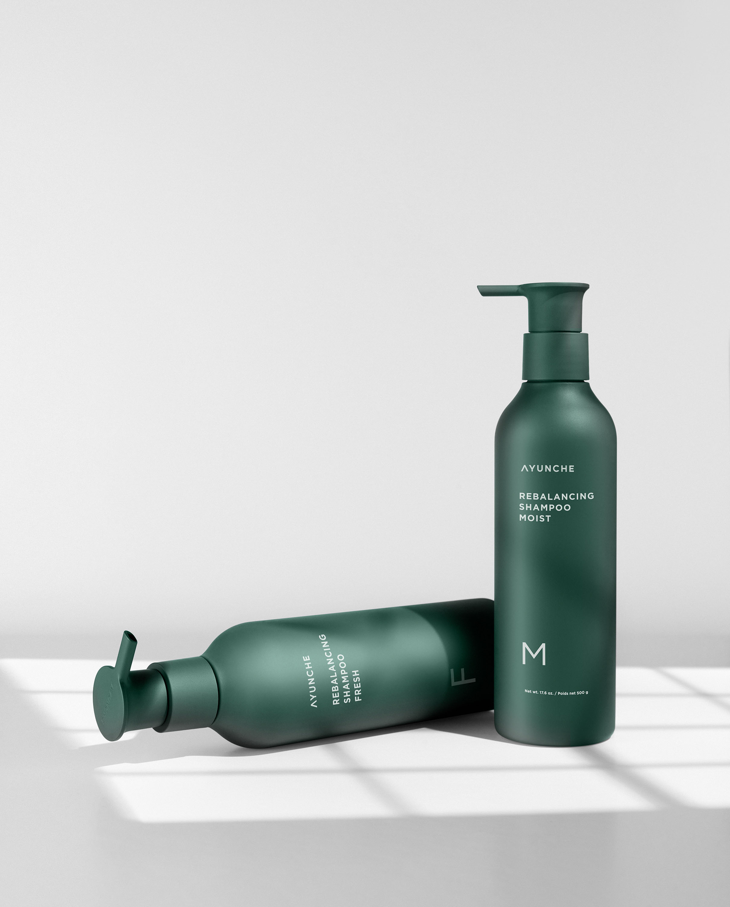
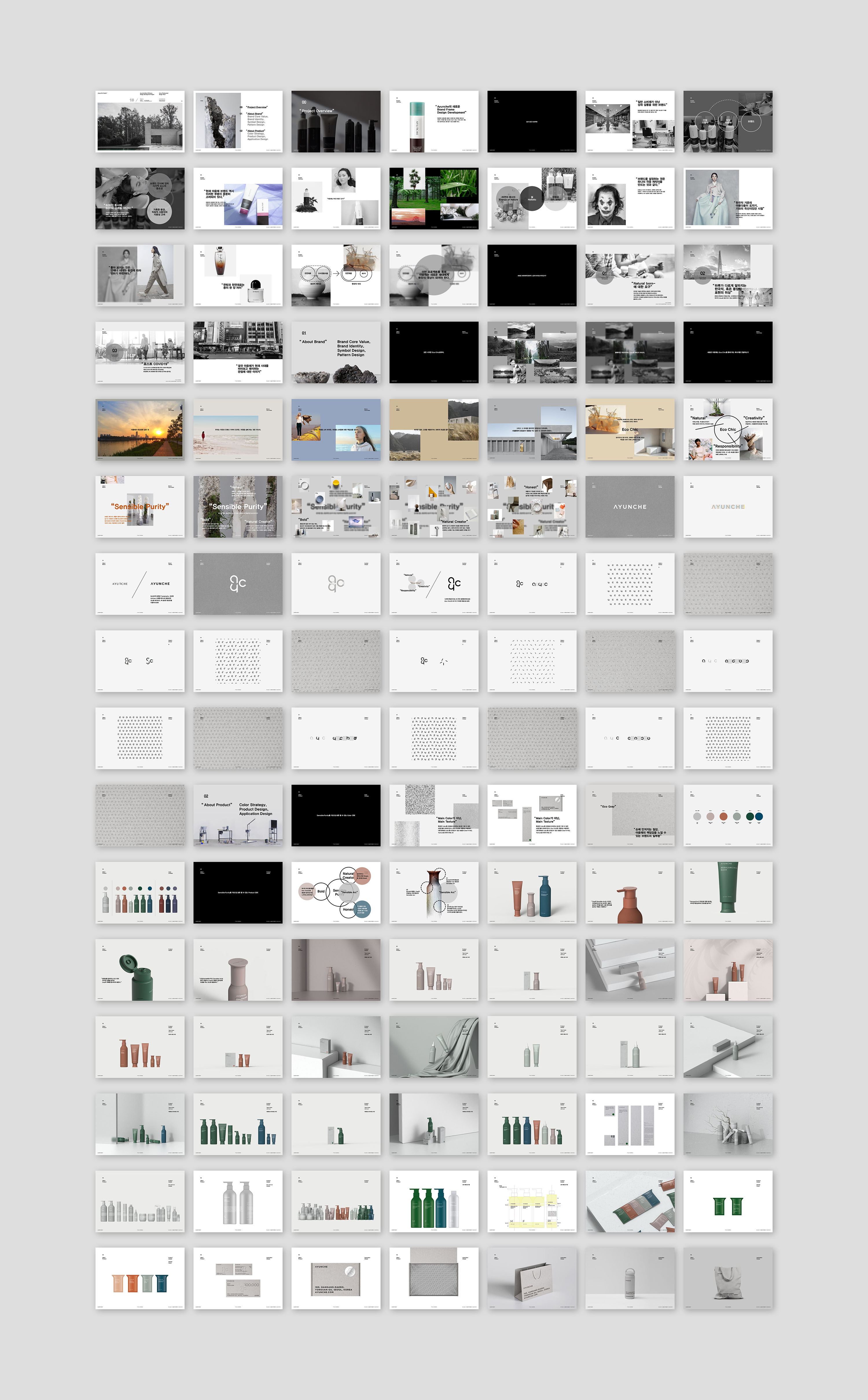
Jiyoun Kim Studio presents the Brand refreshment project with Ayunche. Ayunche is
a high-end brand that targets luxury hair salons by Amos Professional, a hair
products company and a subsidiary of Amorepacific. In this project, Jiyoun Kim
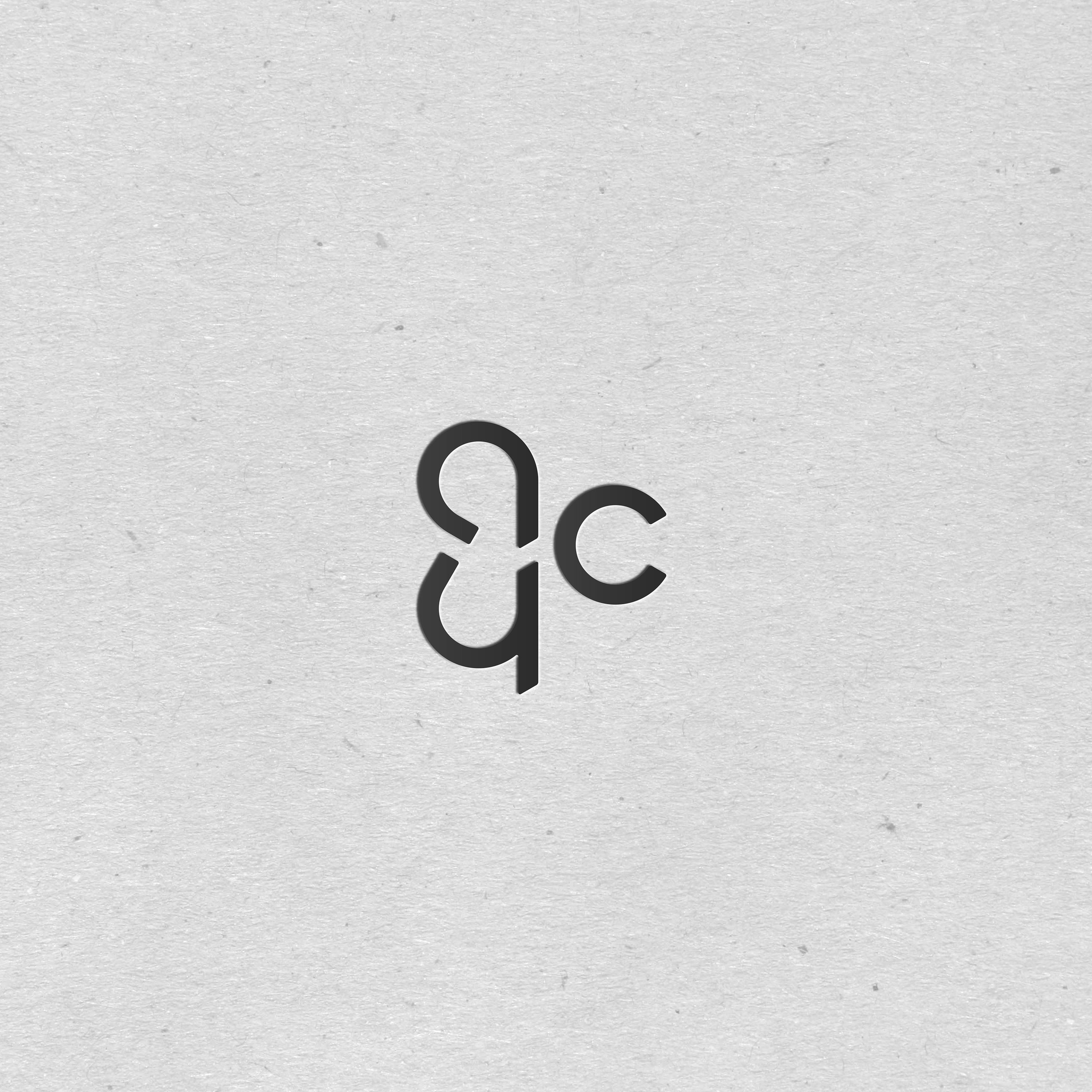
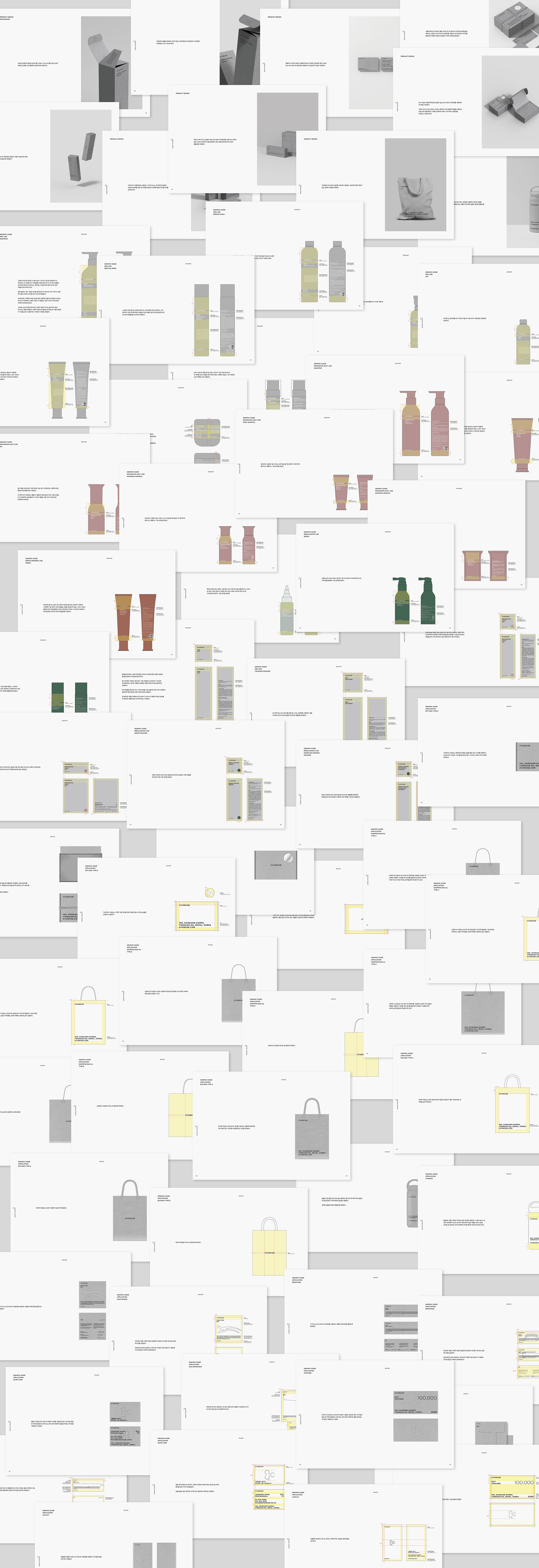
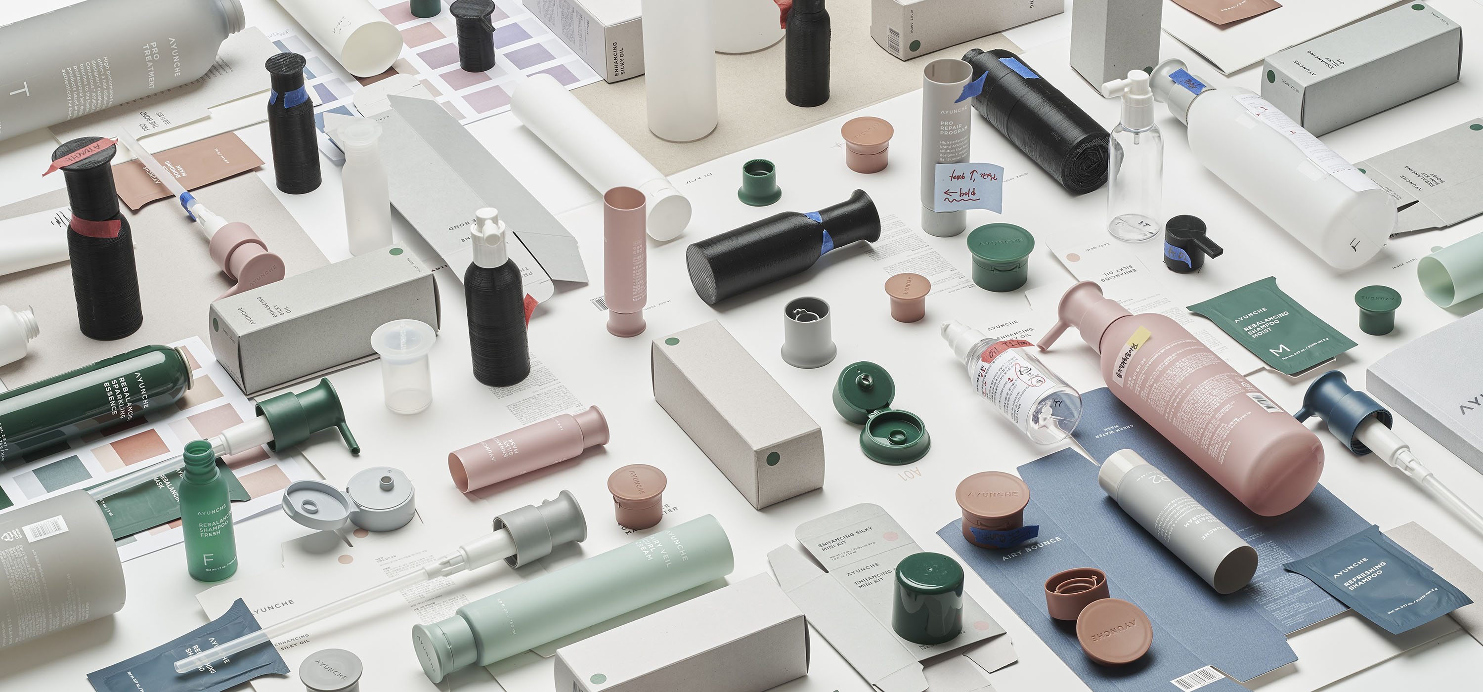
Studio covered every design aspect surrounding the Ayunche brand, including BI,
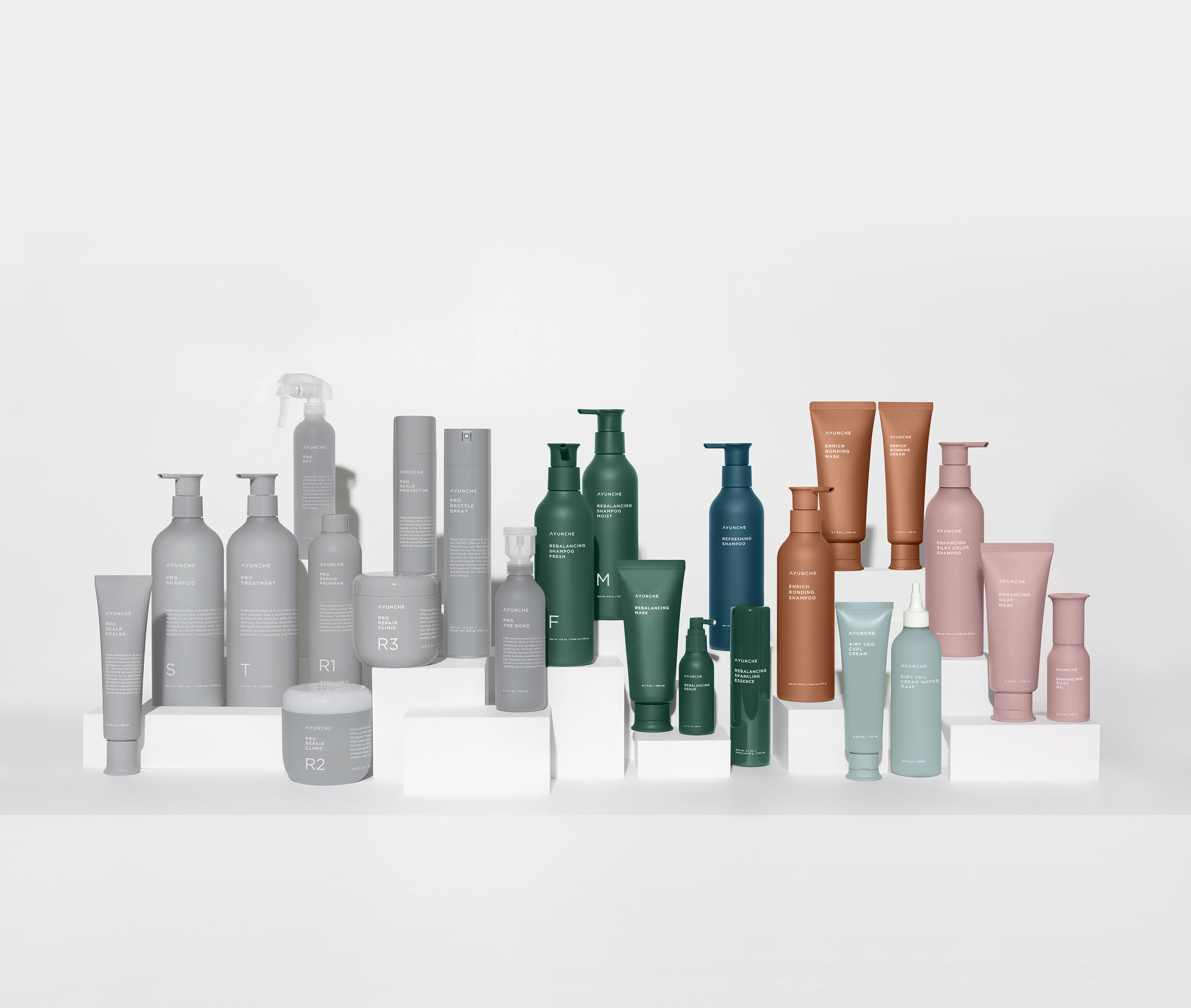
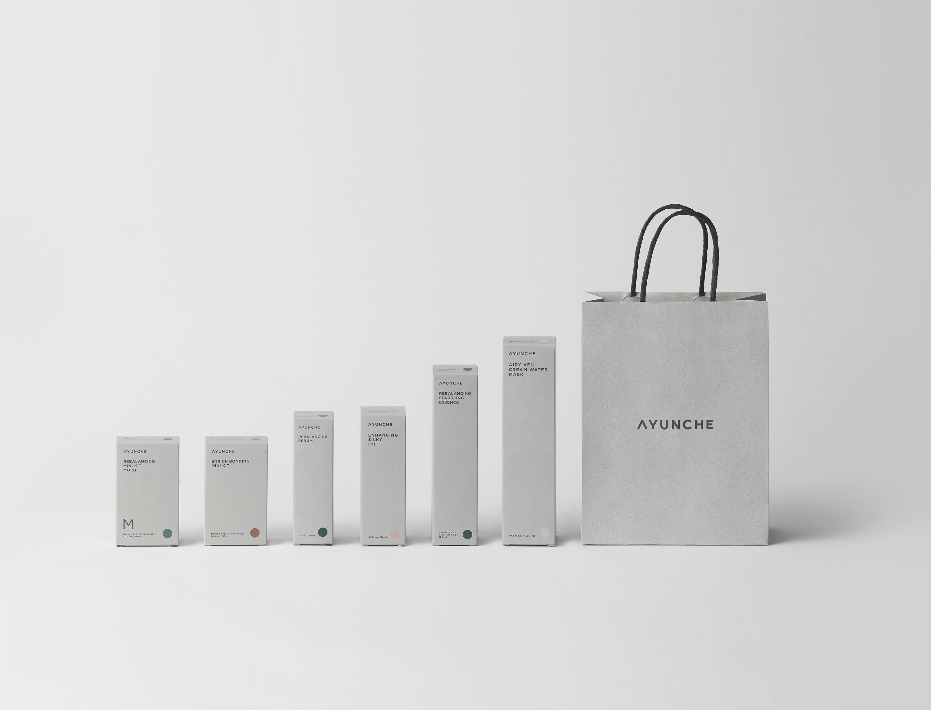
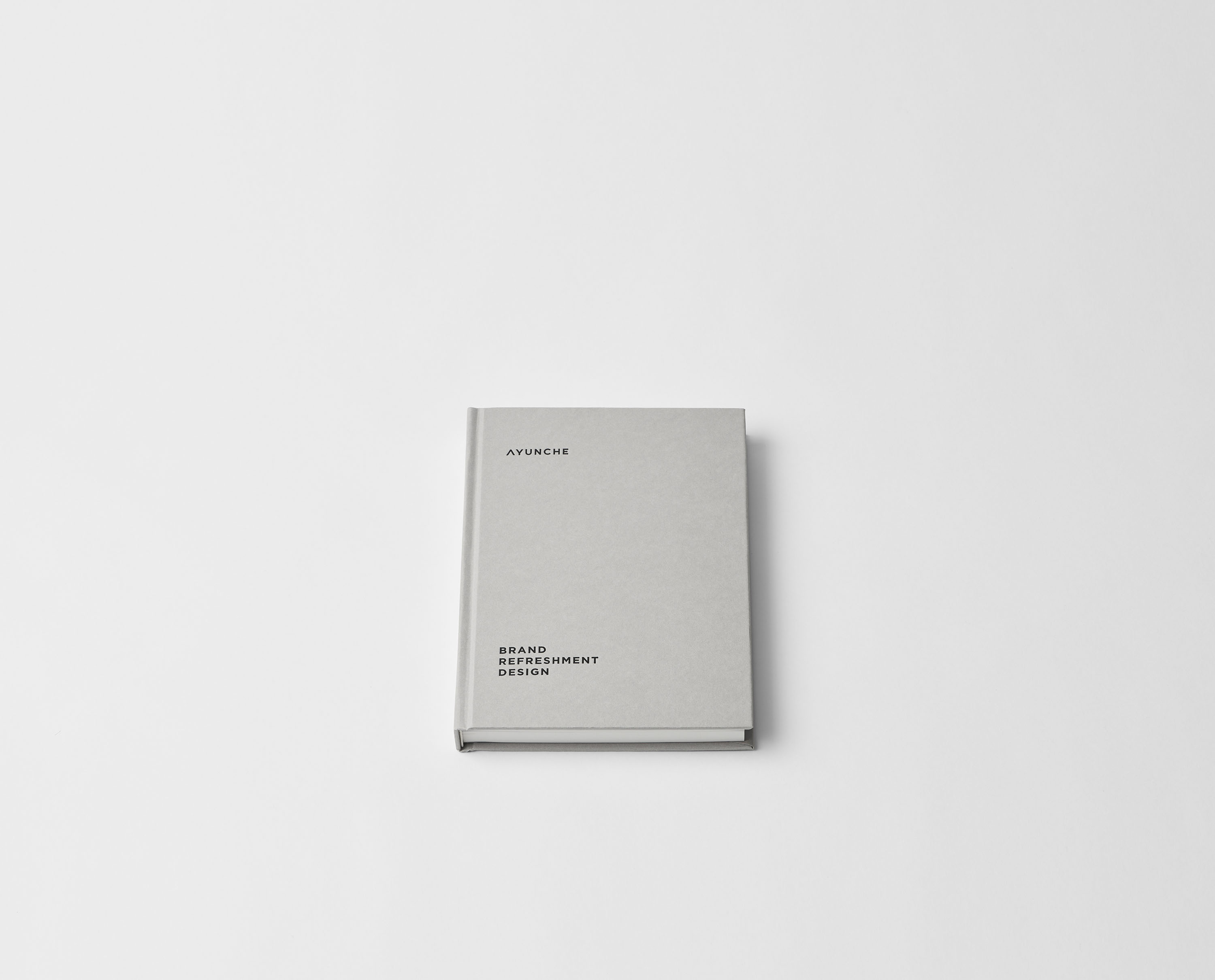
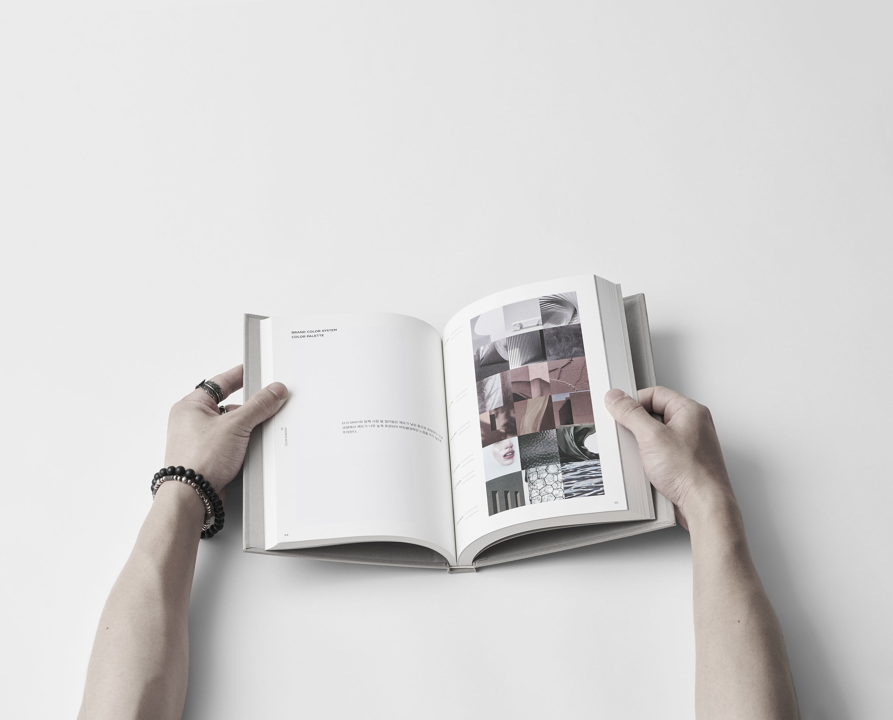
Brand Guideline, Symbol, Pattern, Color Strategy, 40+ variations of products and
packages, and various applications.
Taking place years after the initial launch of Ayunche, the project had several
challenges. With the emergence of numerous competitors targeting luxury hair
salons and the transformation of hair salons led by a new generation, Ayunche’s
strength in distribution infrastructure had been fading. Given such
circumstances, Ayunche’s core identity of deriving natural ingredients and
oriental perspective had to reform into a new and refined message and mood to
regain its leading position.
In the course of the Ayunche Brand refreshment project, Jiyoun Kim Studio began
from the analysis of the existing brand heritage and then separated the messages
into being inherited and being refined. While preserving nature, the most
important keyword for Ayunche, Jiyoun Kim Studio aimed to transform the attitude
toward nature. Suppose the existing Ayunche depicts the mystery of the East that
breathes in nature. The renewed Ayunche has to express a more sophisticated,
urban-centric, and trustworthy professional imagery, yet still natural. It does
not form oblivious worship of nature, but a contemplative perspective, as if you
are walking through a park in the city center. While it consumes nature, it
comprehends the meaning of consumption, fulfills its social responsibilities,
and it does respect nature but never worships. Avoiding extravagance and
cacophony, yet inspiring the surroundings creatively when expressed. Jiyoun Kim
Studio, together with Ayunche, defined the core keyword as Eco-Chic and revealed
it as a penetrating attitude through the entire brand.
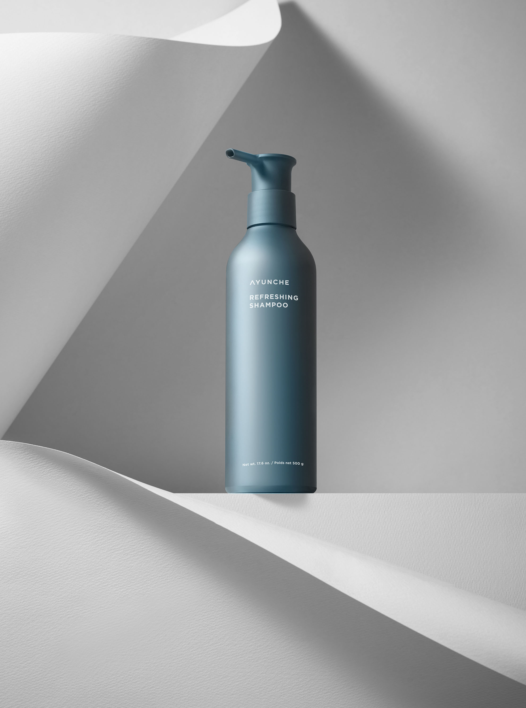
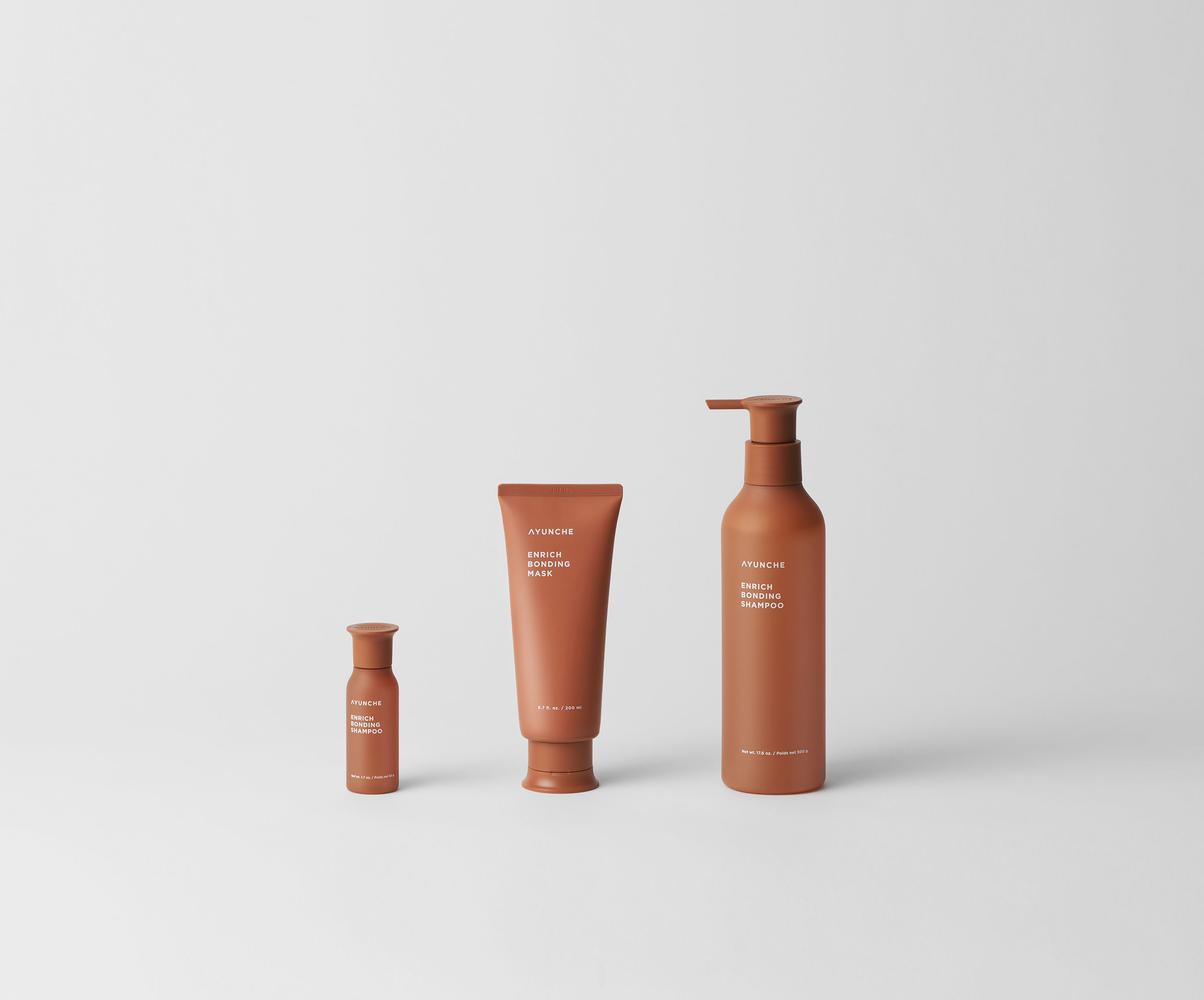
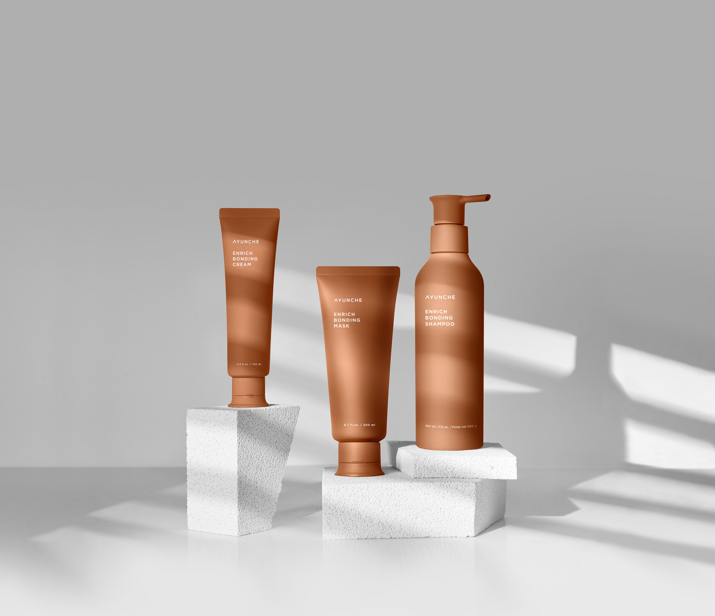
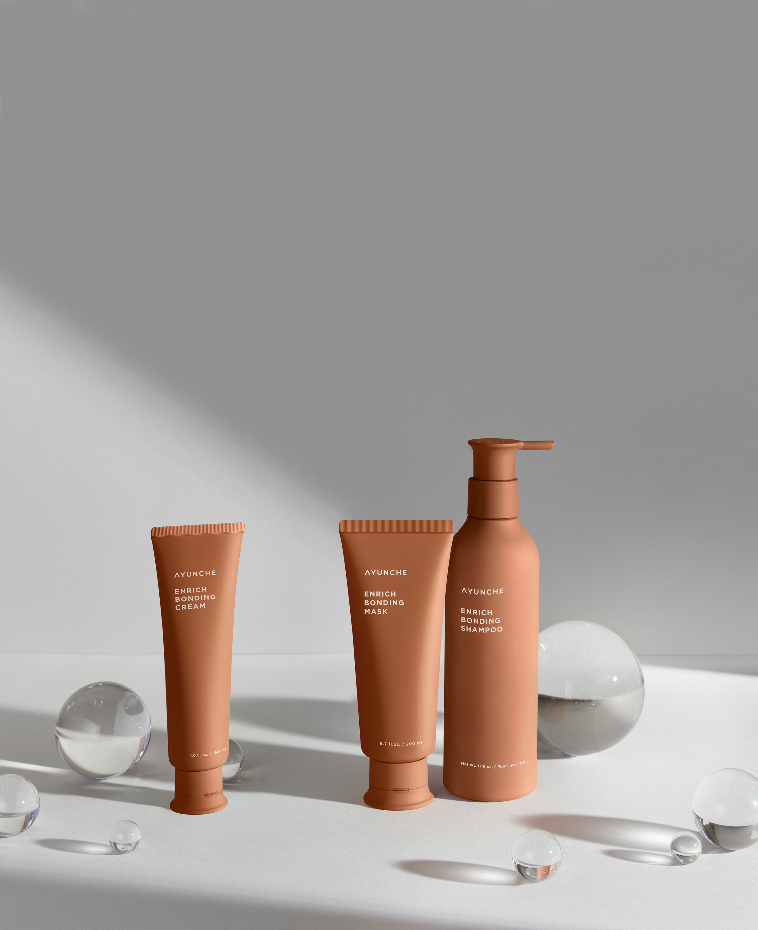
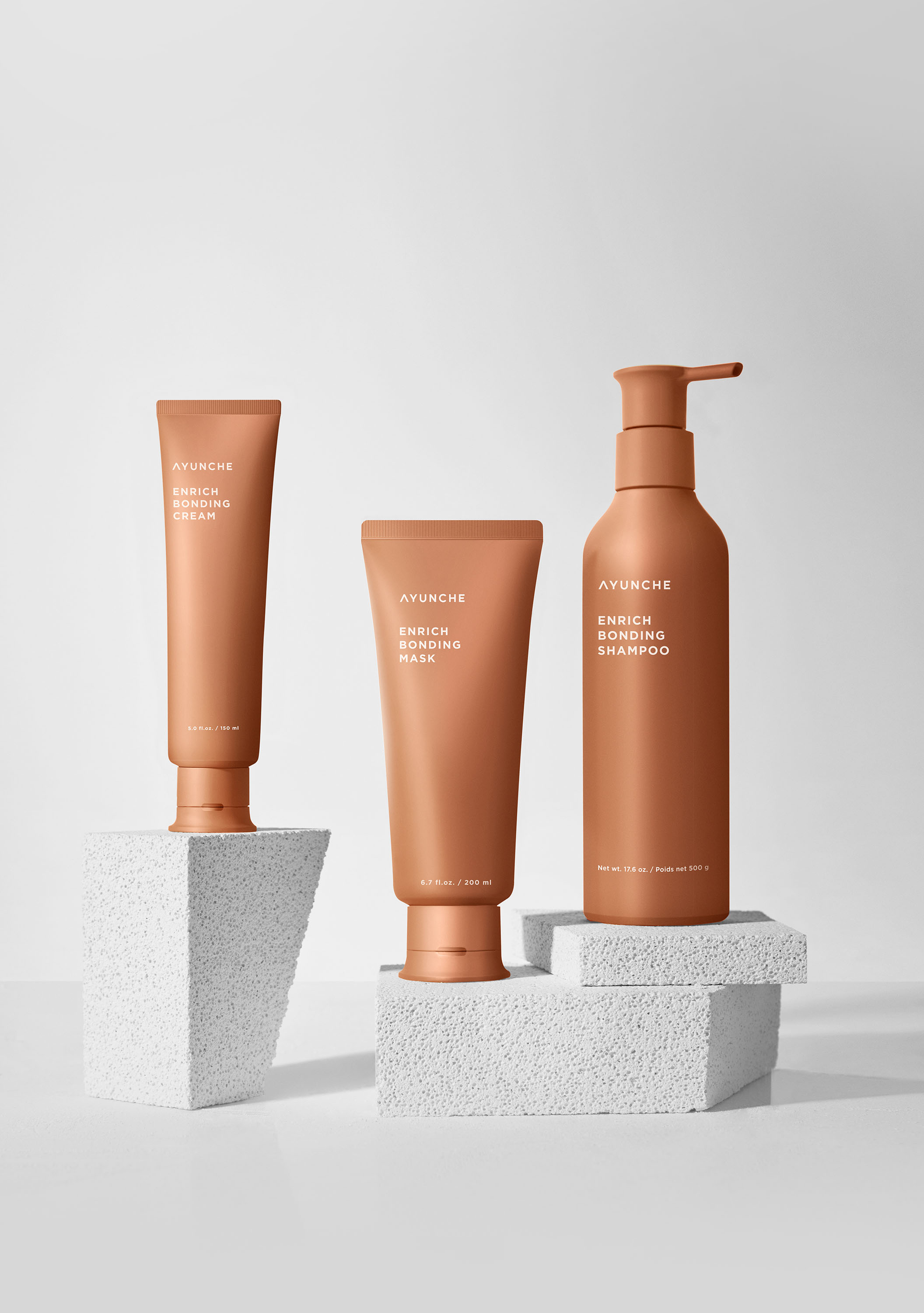
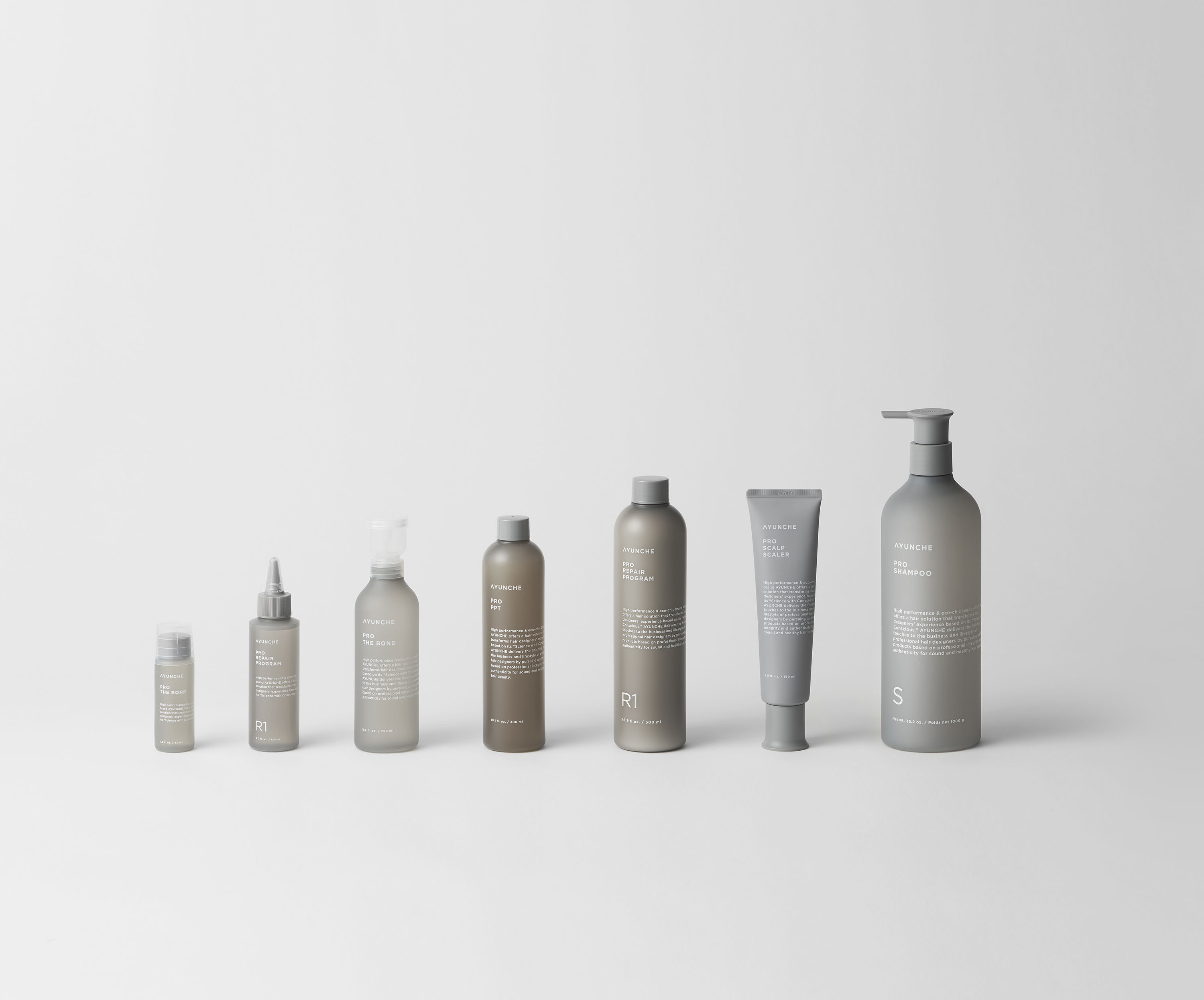
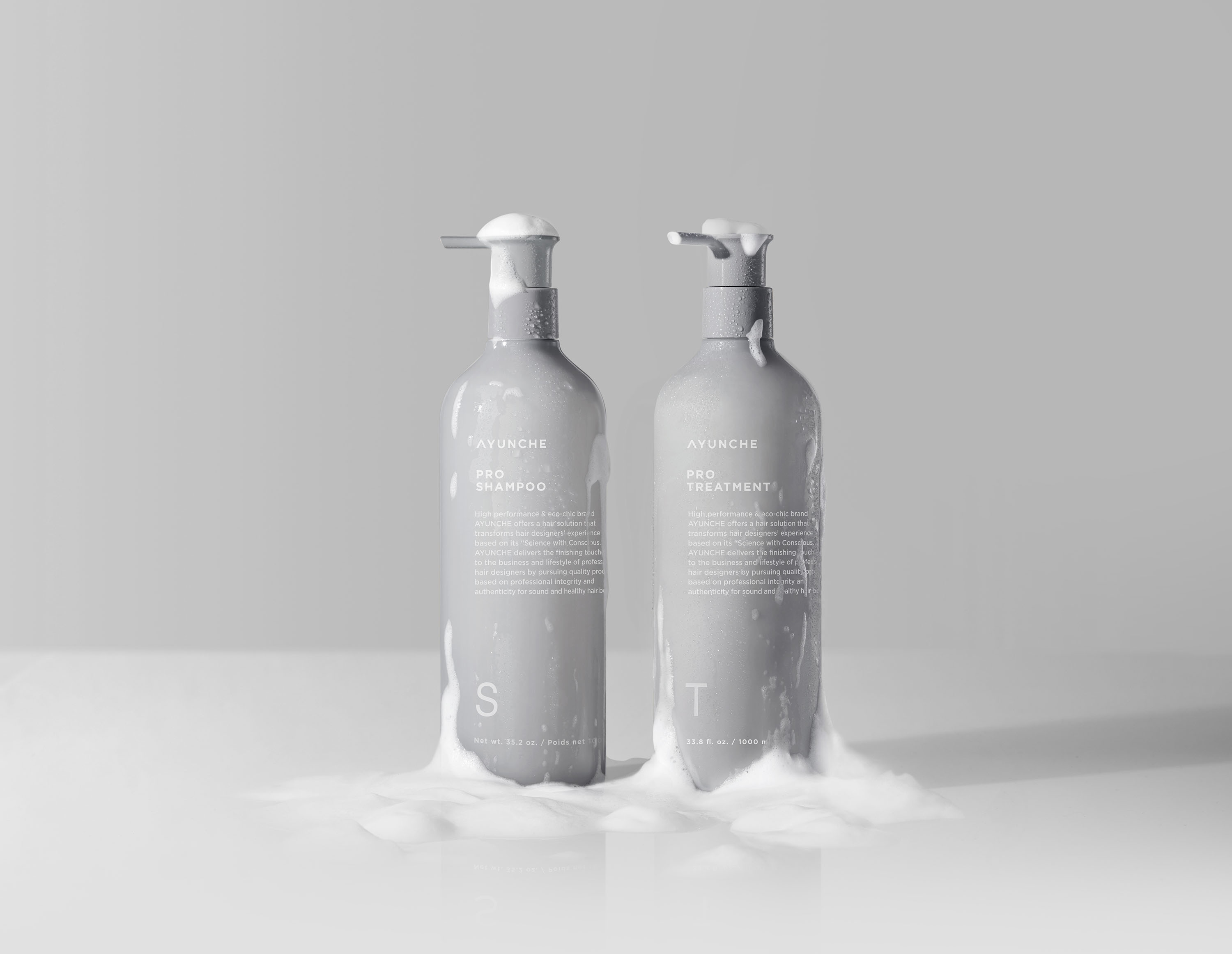
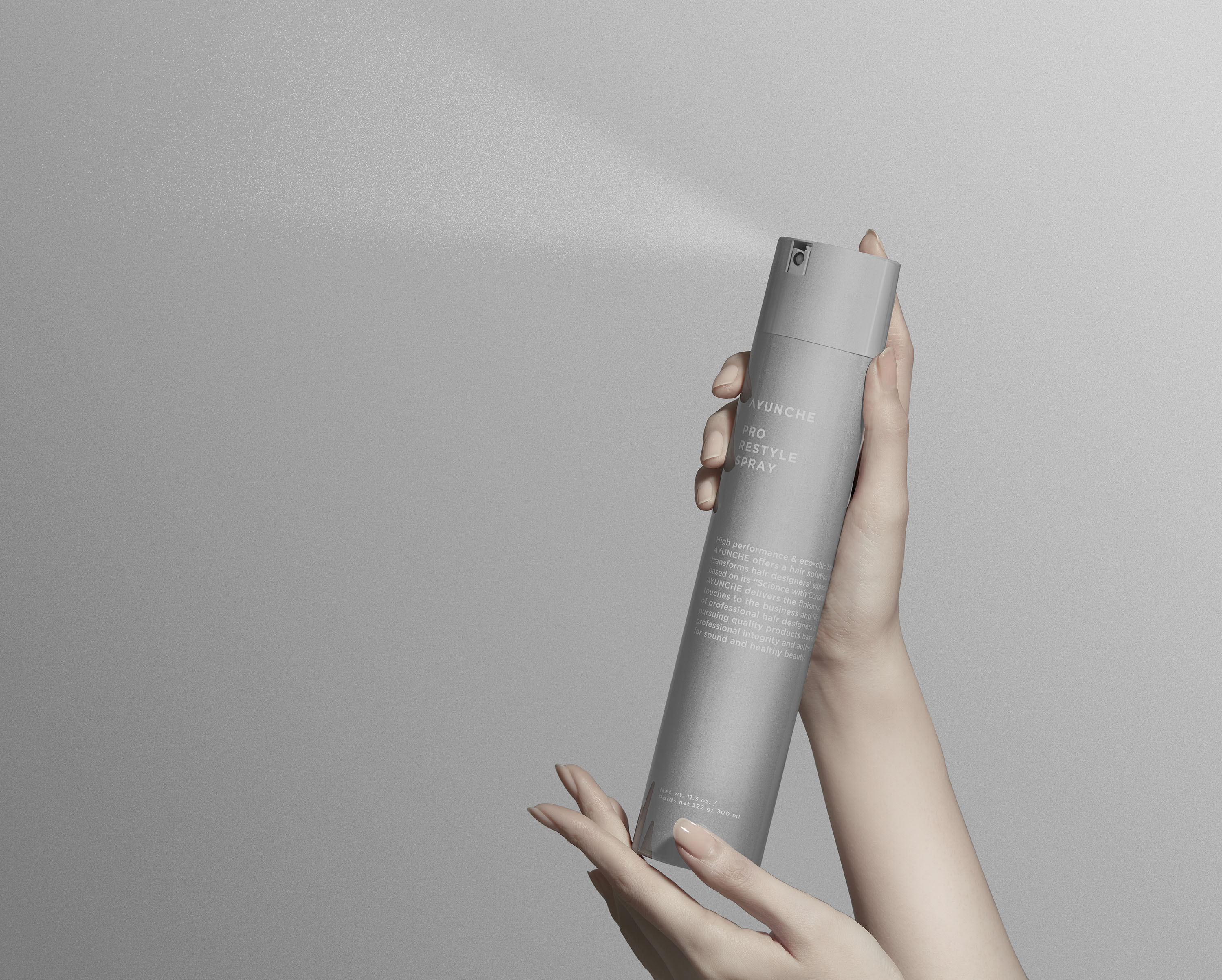
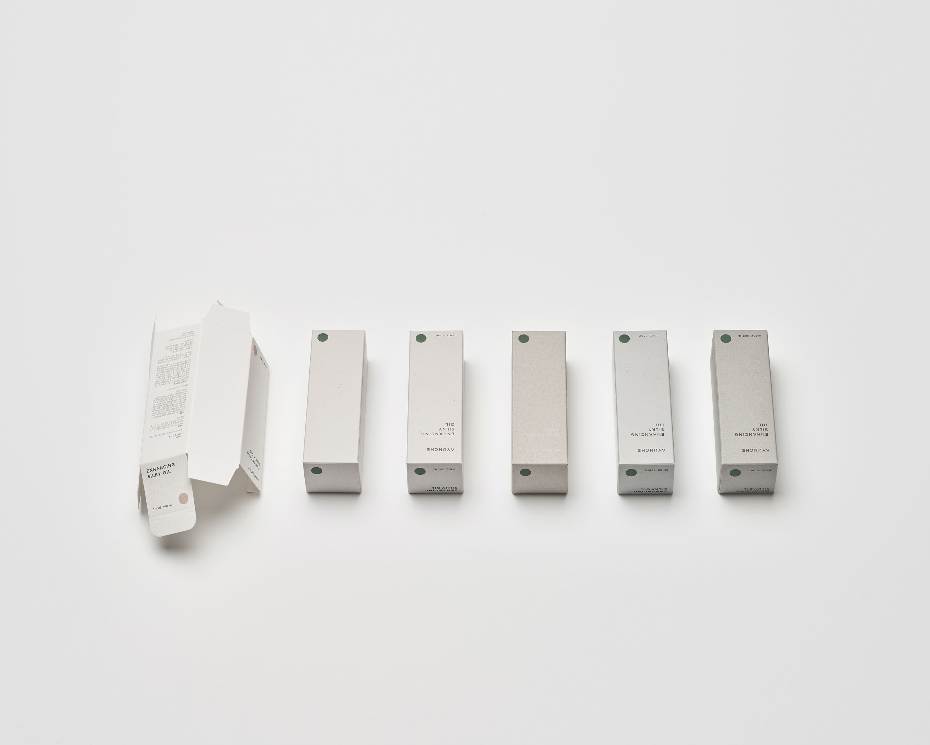
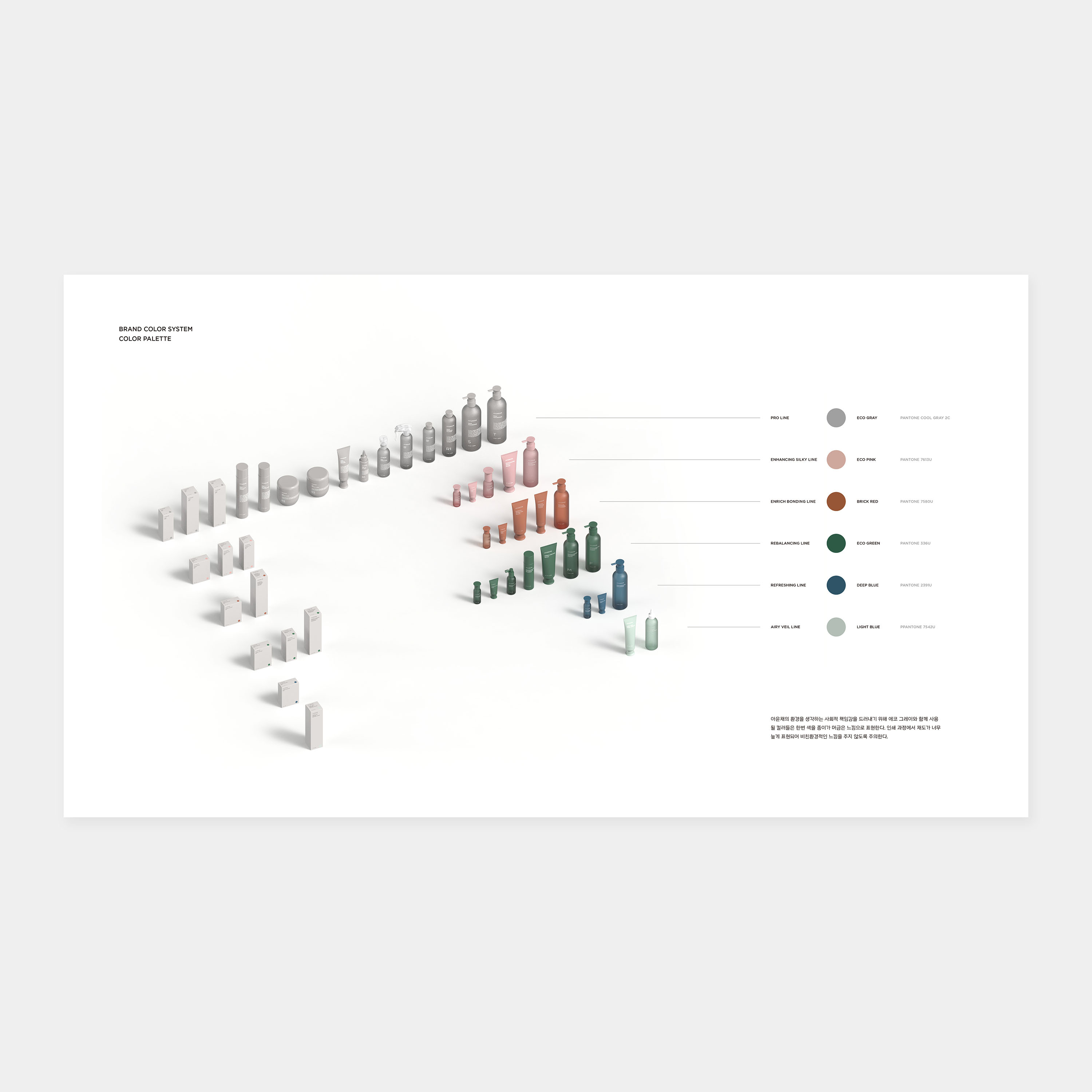
To express Eco-Chic, Jiyoun Kim Studio focused on the material, not color.
Unlike most brands' typical concept of the main color, Ayunche’s main material
demonstrates a slightly different approach and unique attitude. Eco Gray, the
main material representing Ayunche, symbolizes the unique texture of the
recycled paper. It is expressed using all types of recycled papers and focuses
on natural textures rather than processed colors when touched by hand. Eco Gray
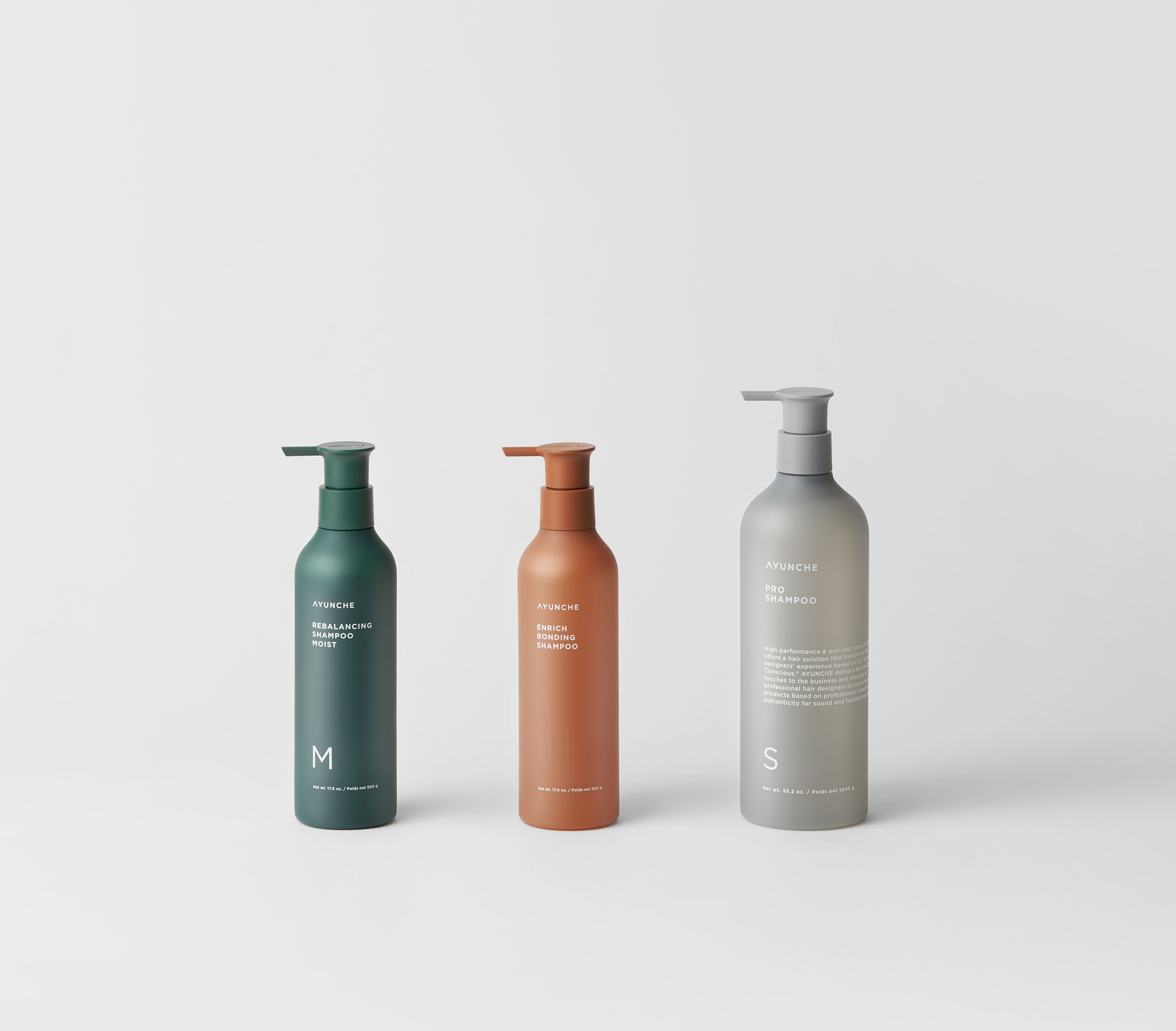
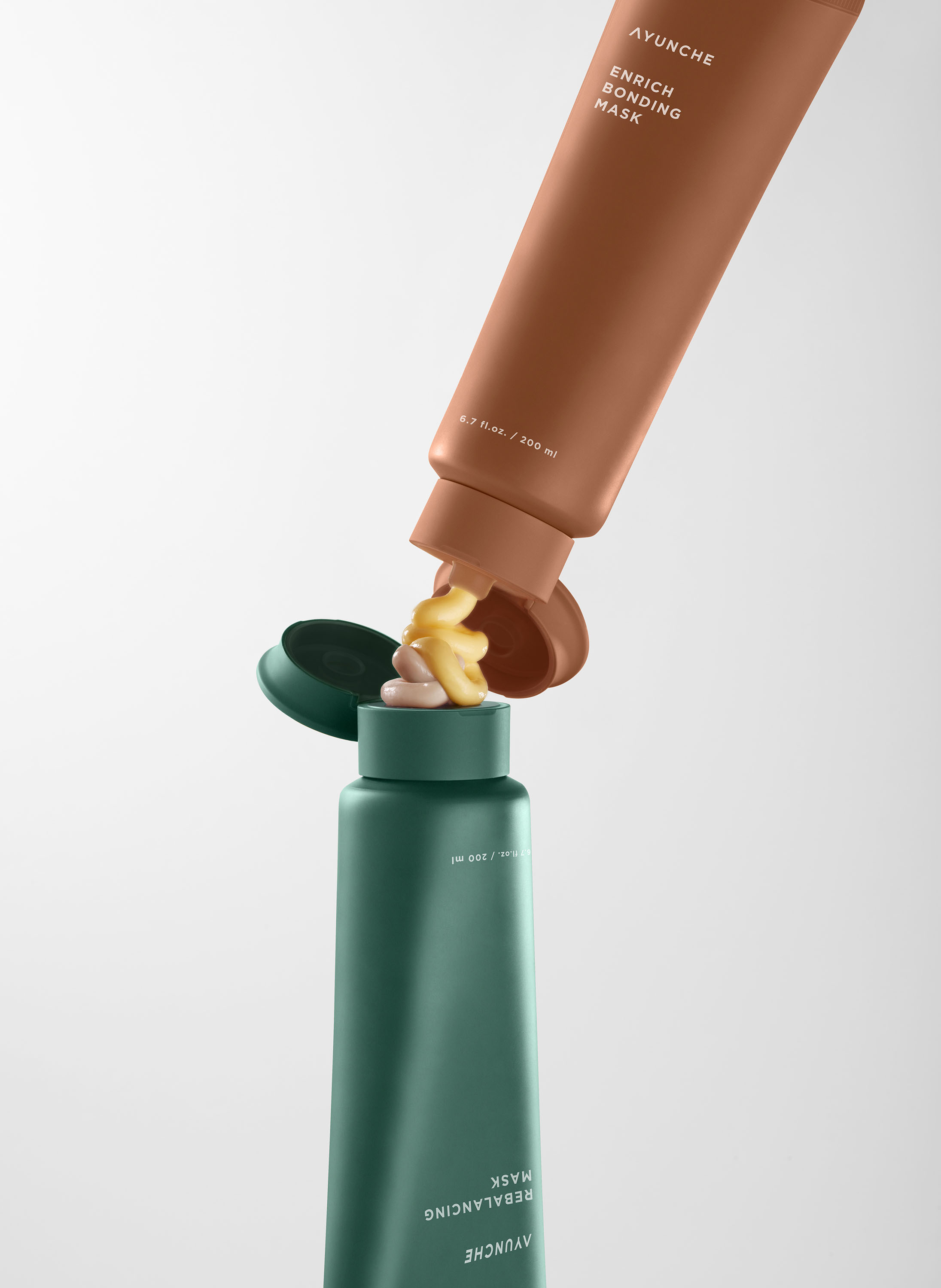
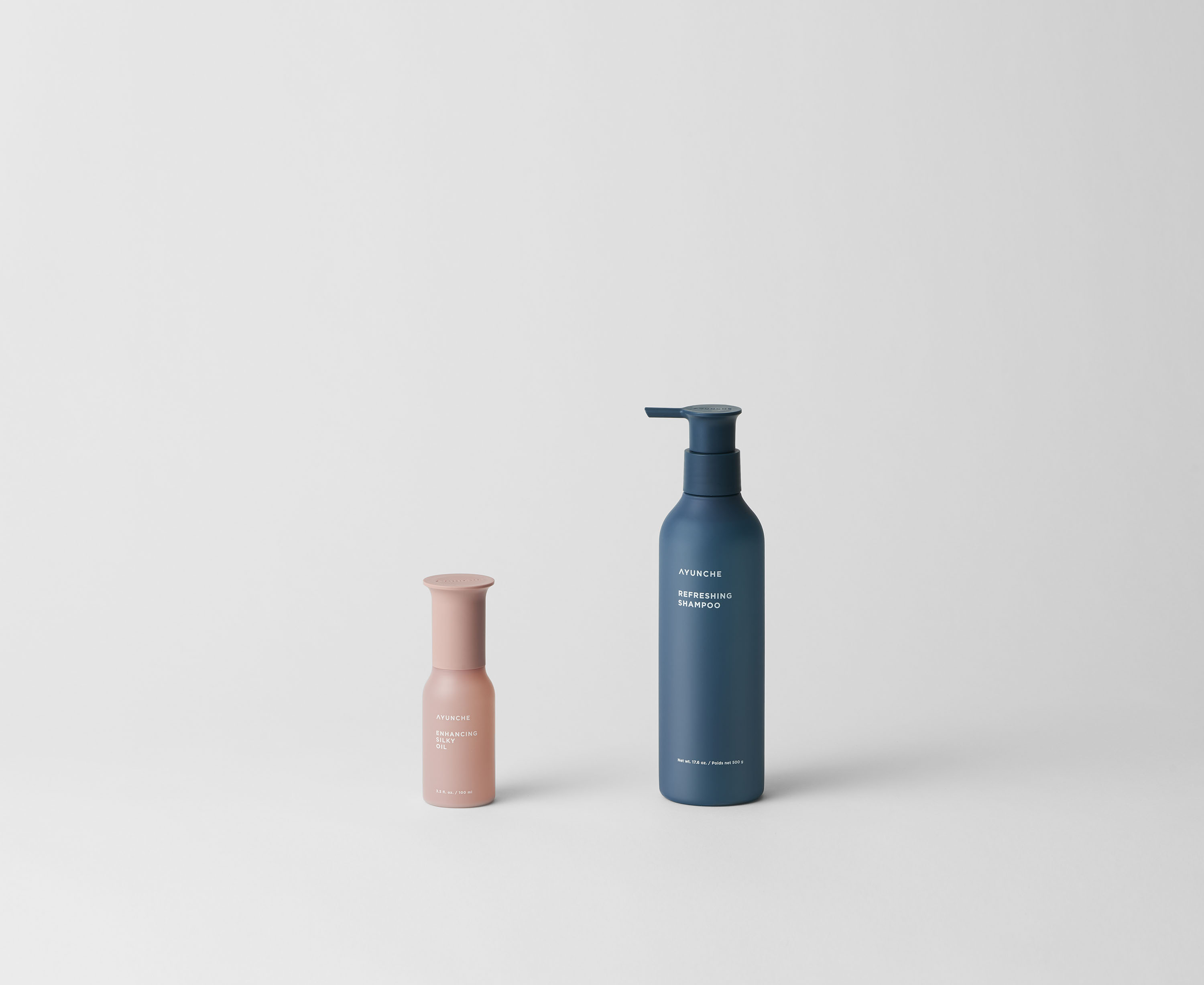
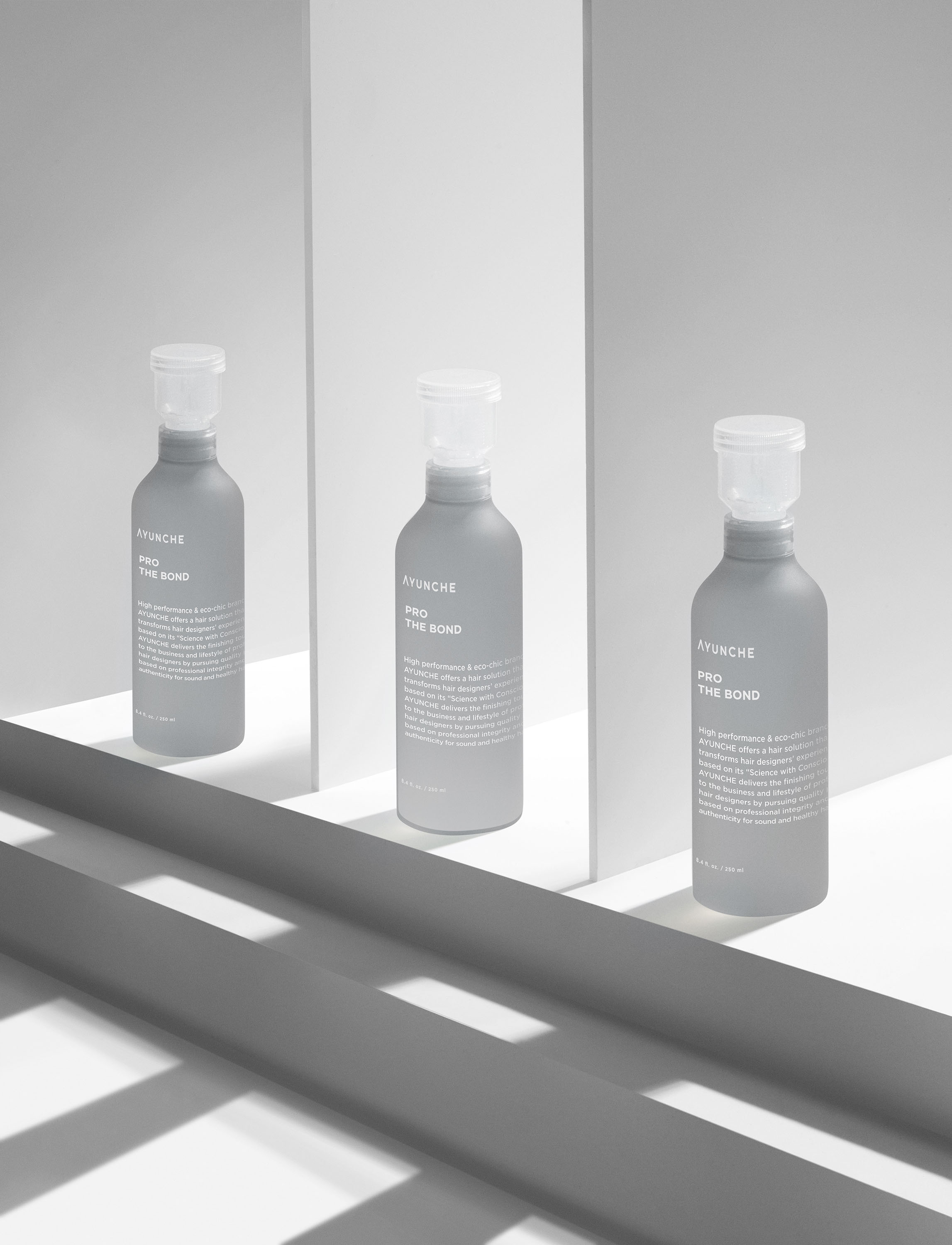
is applied to the Pro line for professionals, which accounts for most Ayunche
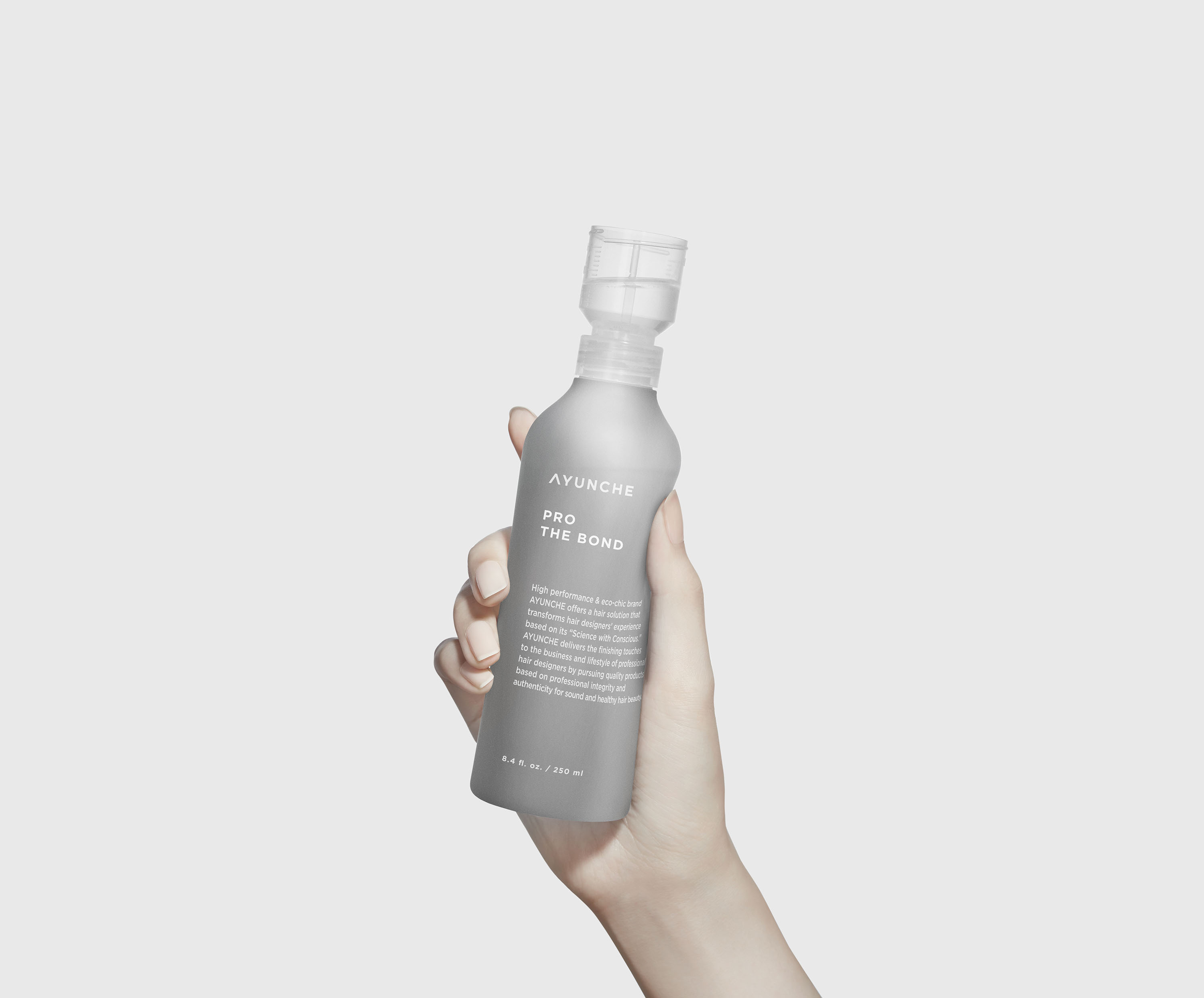
product lineups. The Pro line uses a low saturated and semi-transparent
container as a standard yet makes a natural difference by slightly revealing the
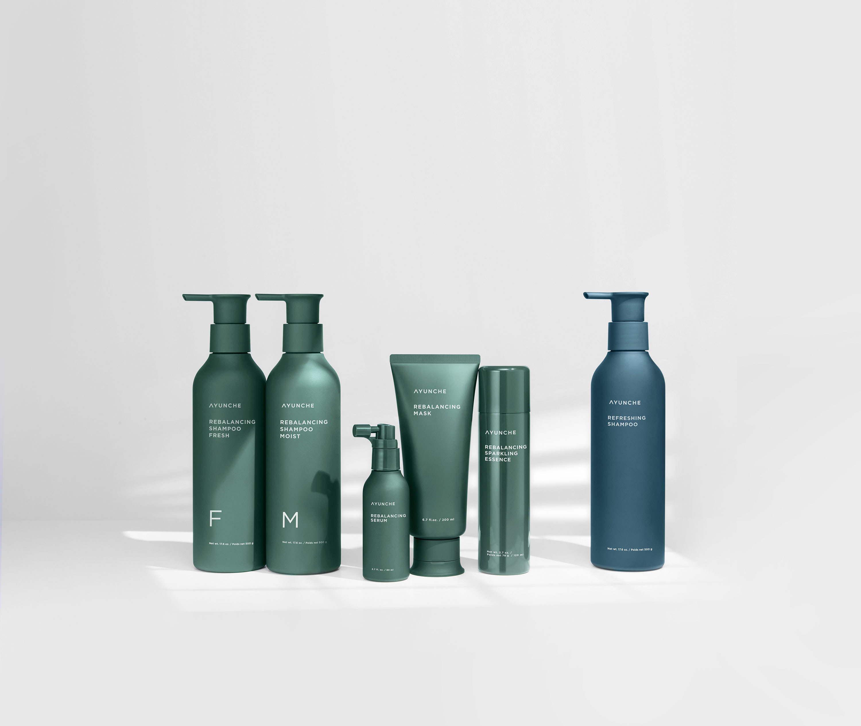
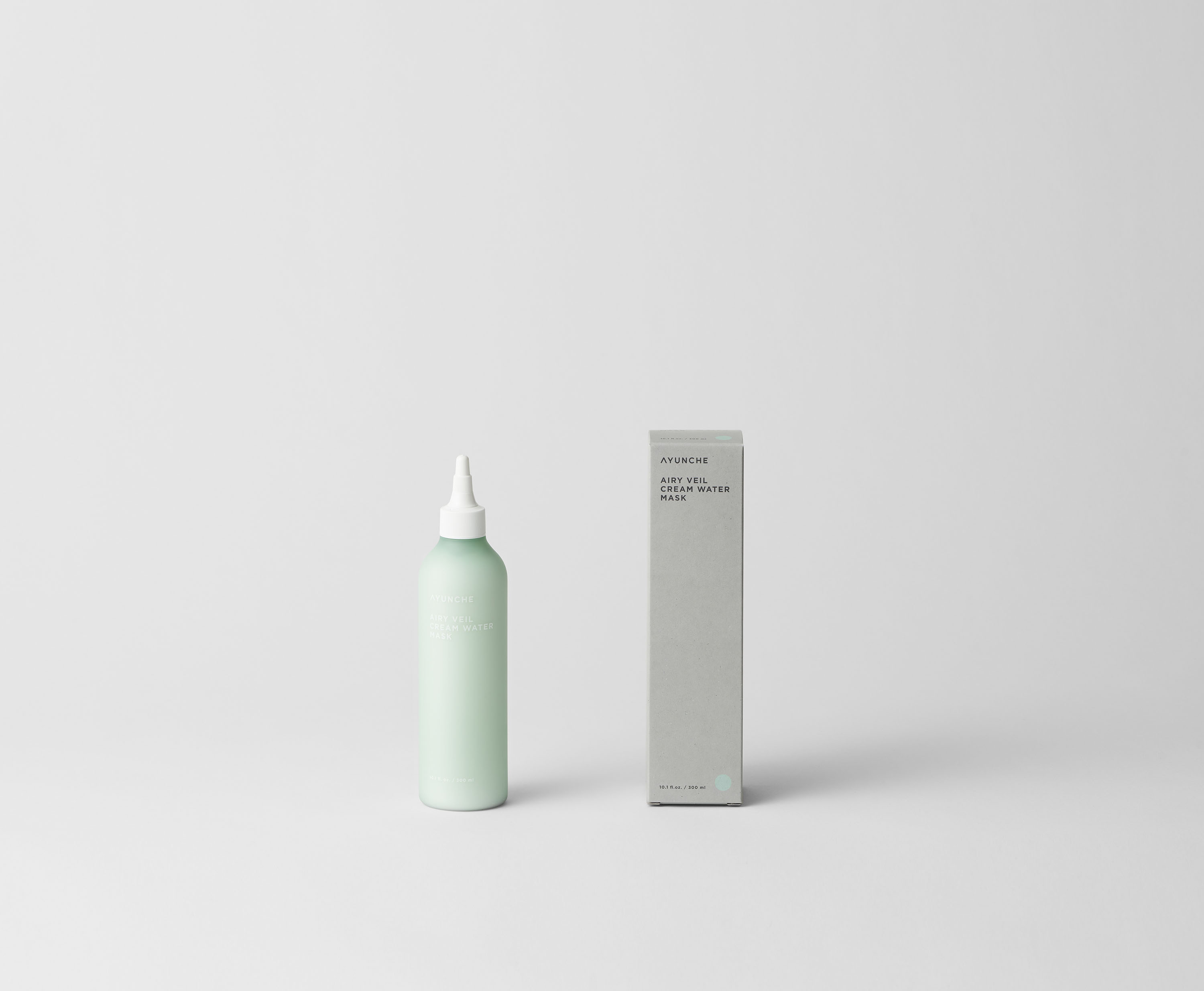
solutions in the container. Take Home lineup uses low saturated colors derived
from nature to seamlessly blend with Eco Gray. Like the Pro line, it naturally
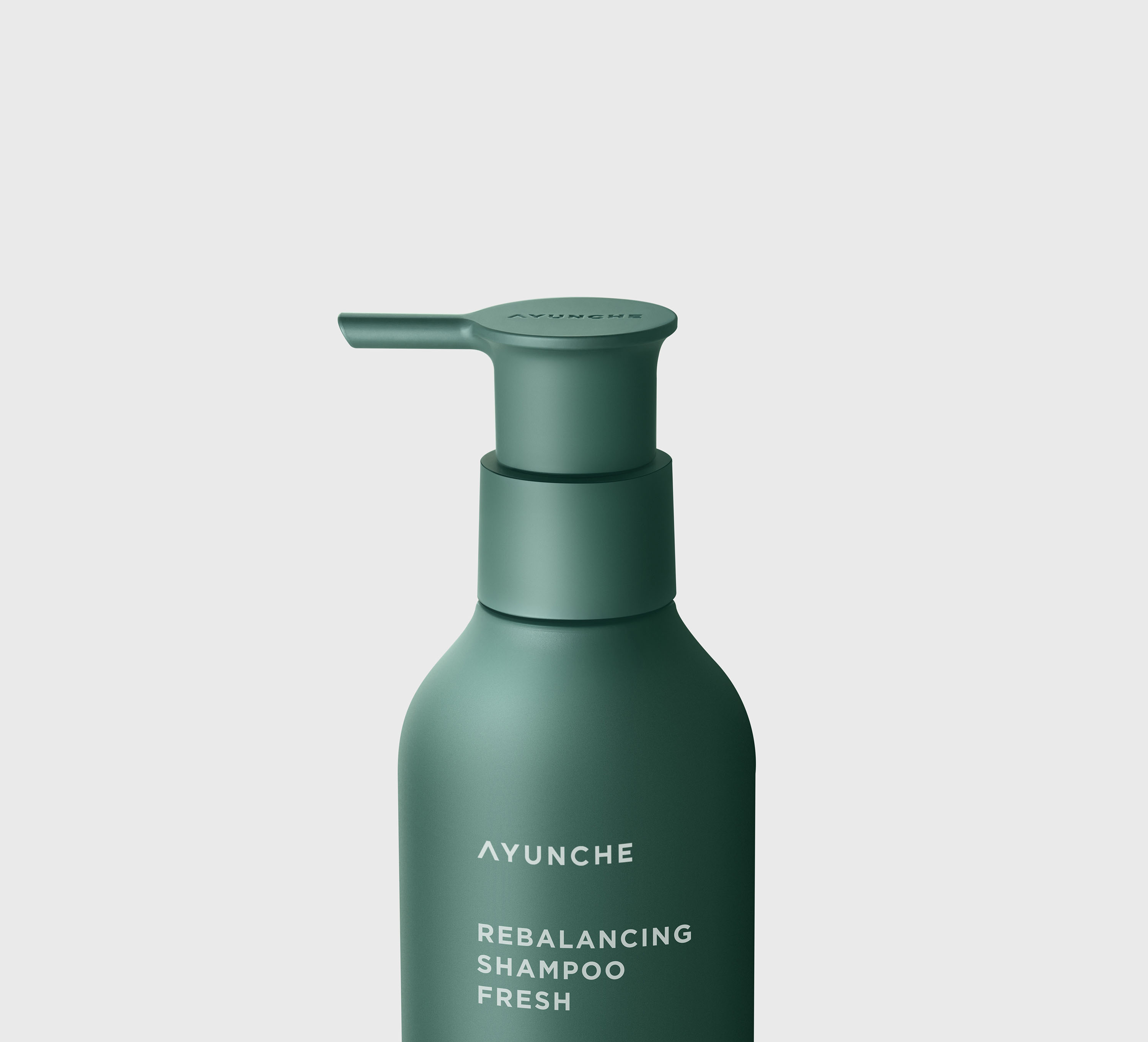
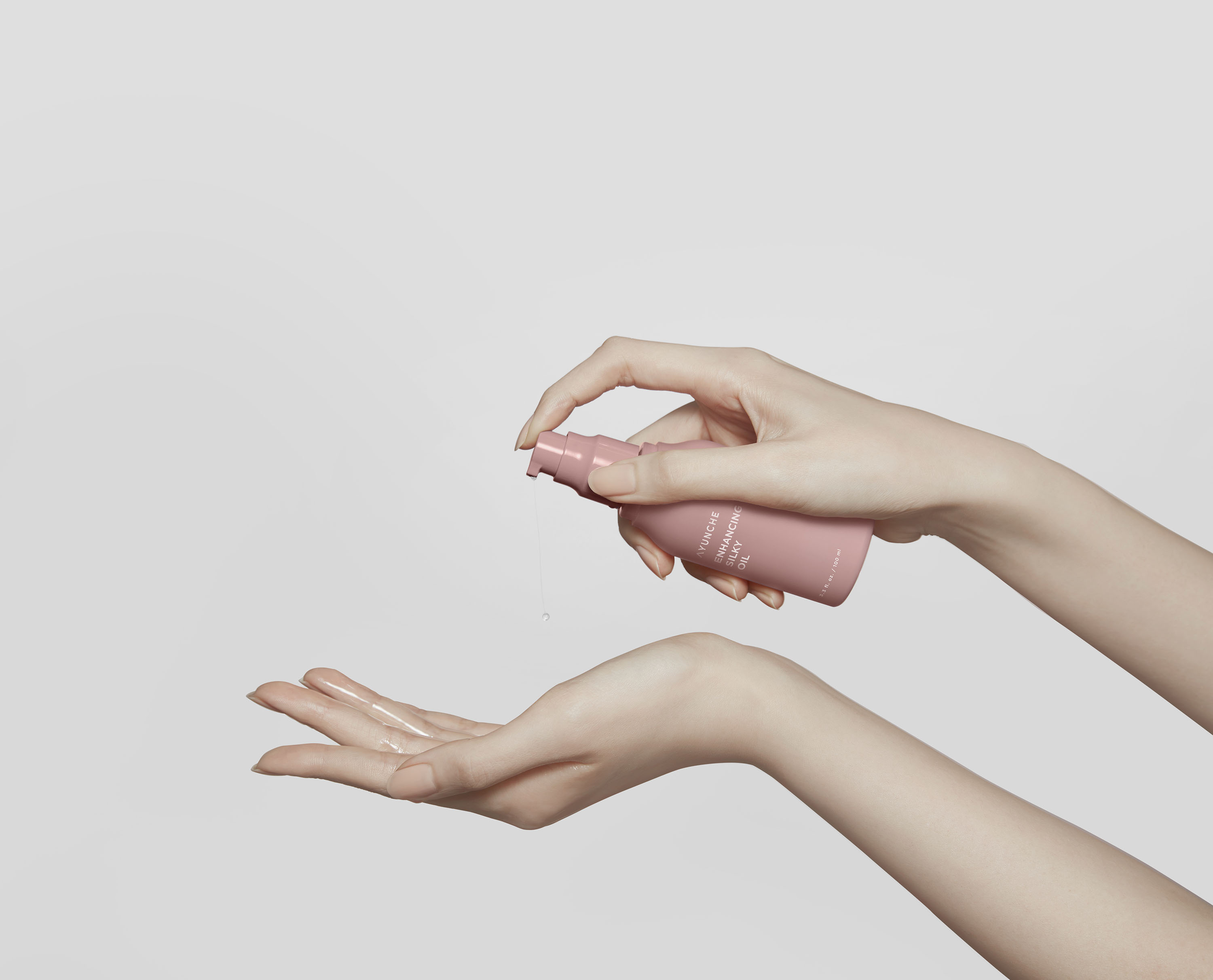
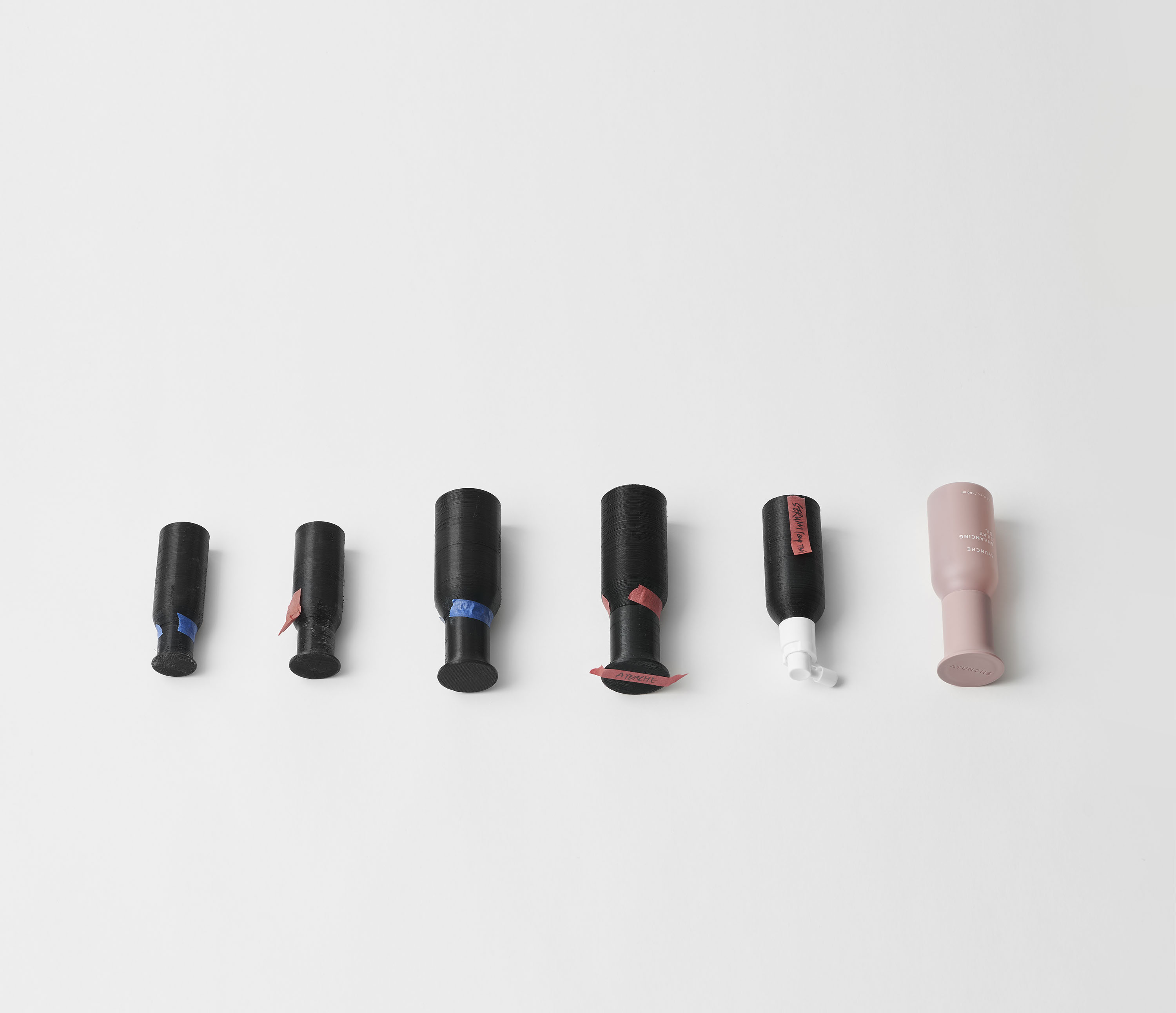
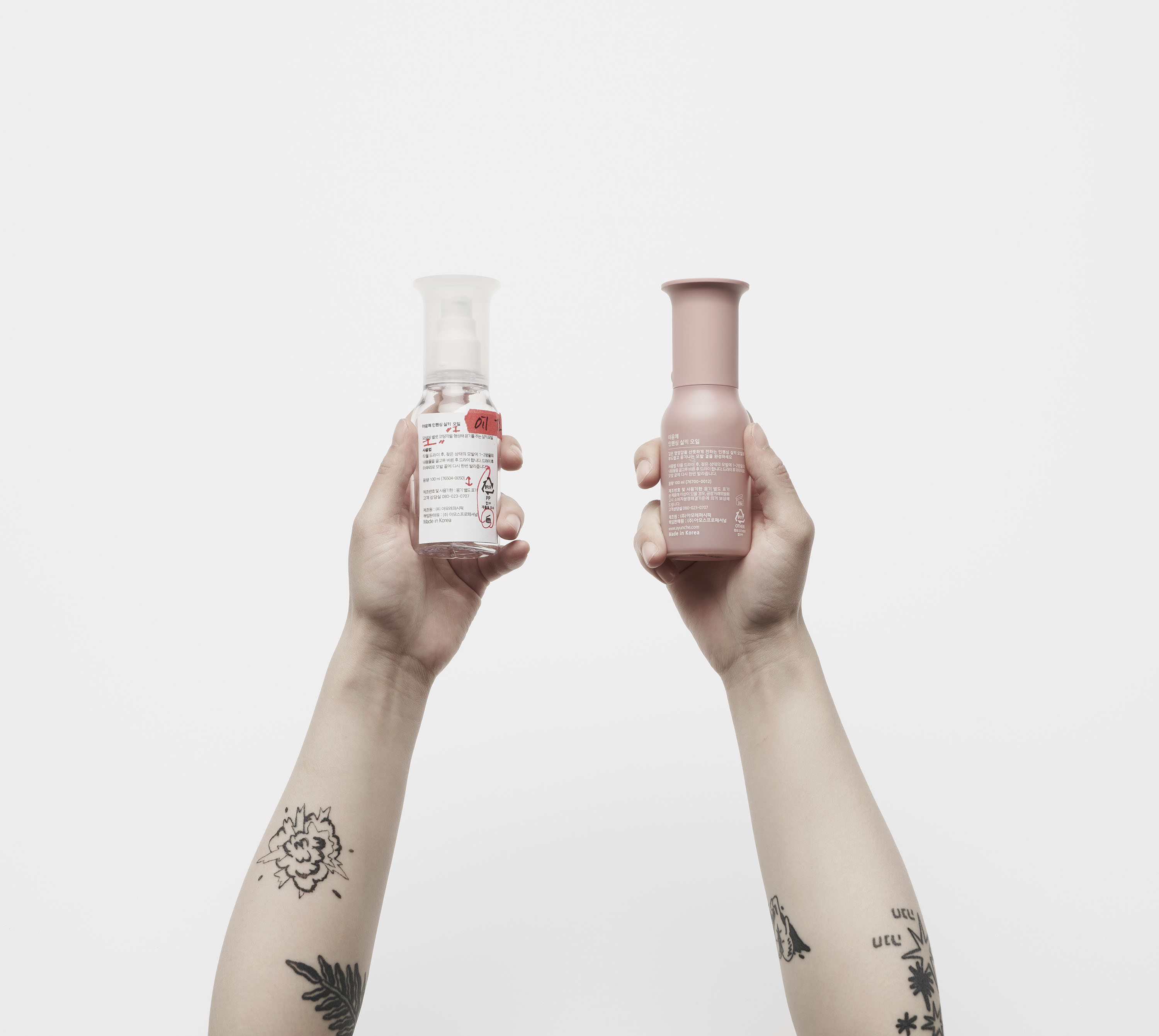
reveals the characteristics of the materials each container has. In the product,
the lid's widening-tip shape plays a role in creating a natural change within
the simple and restrained outline. This element not only expresses the brand
visually but also ameliorates the actual functionalities such as the usability
of opening and closing the cap, usability of the pump, and stability when placed
on the floor.
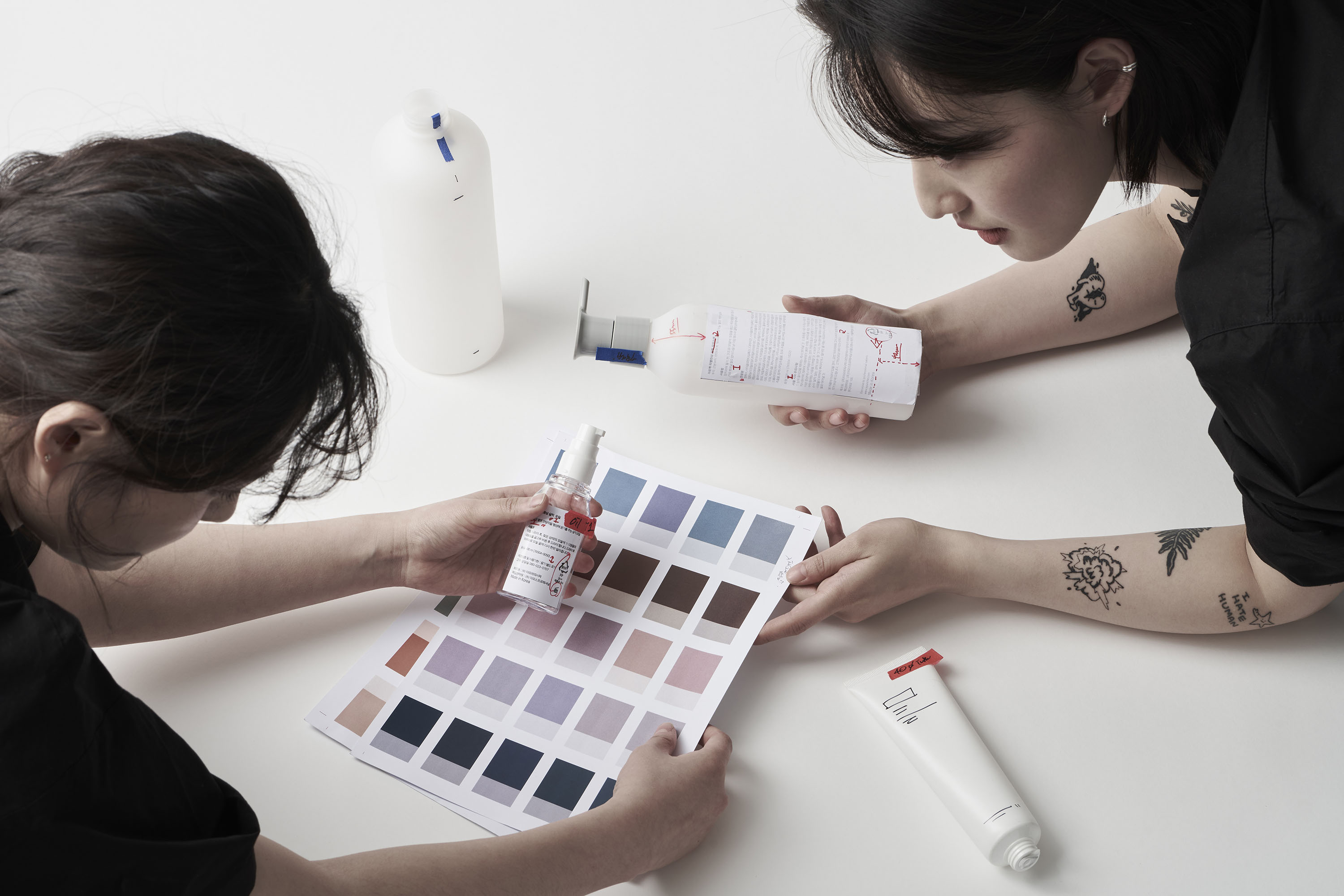
The new Ayunche products, the collaboration between Jiyoun Kim Studio and Amos
Professional, have been on sale since their launch in May 2021.






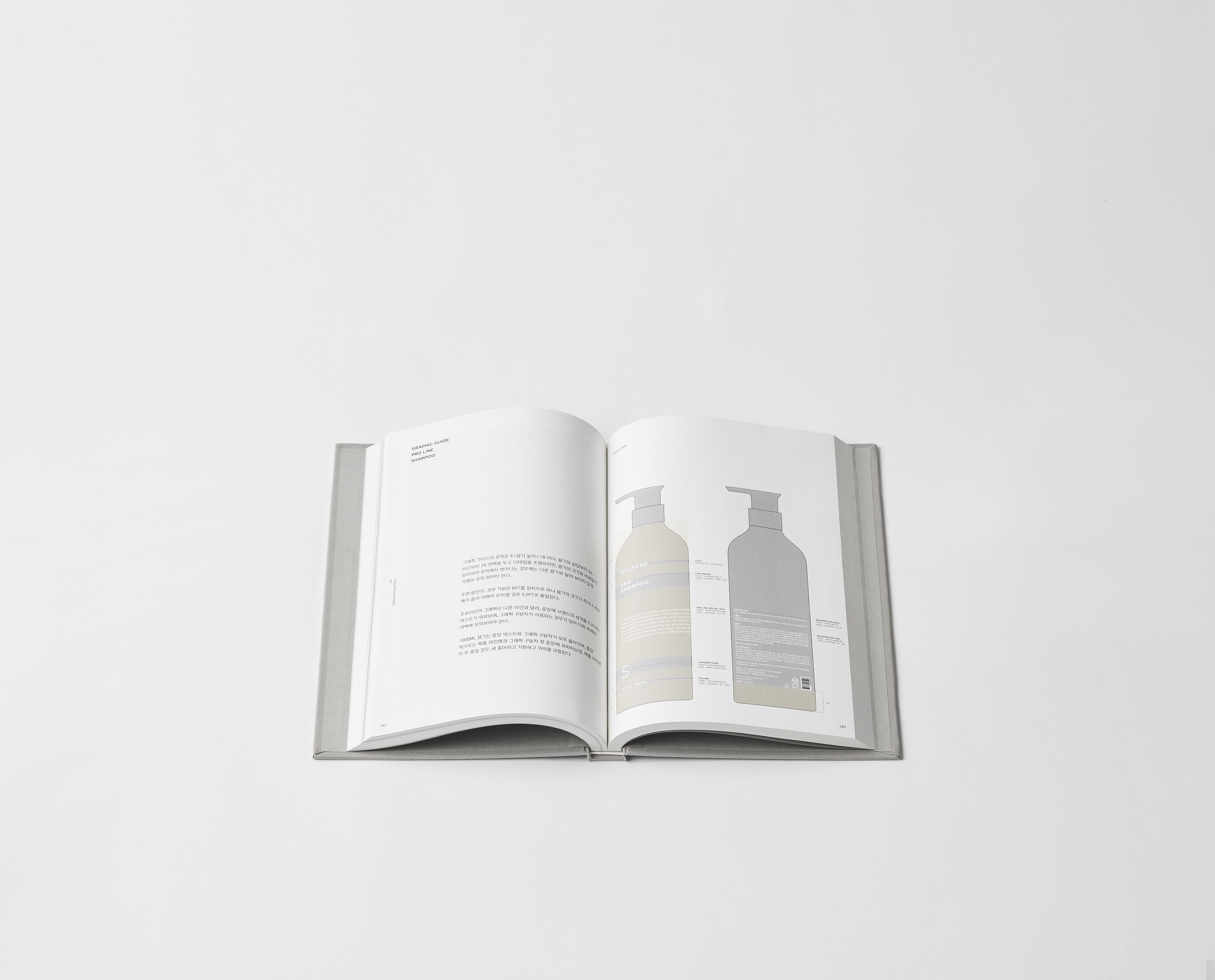
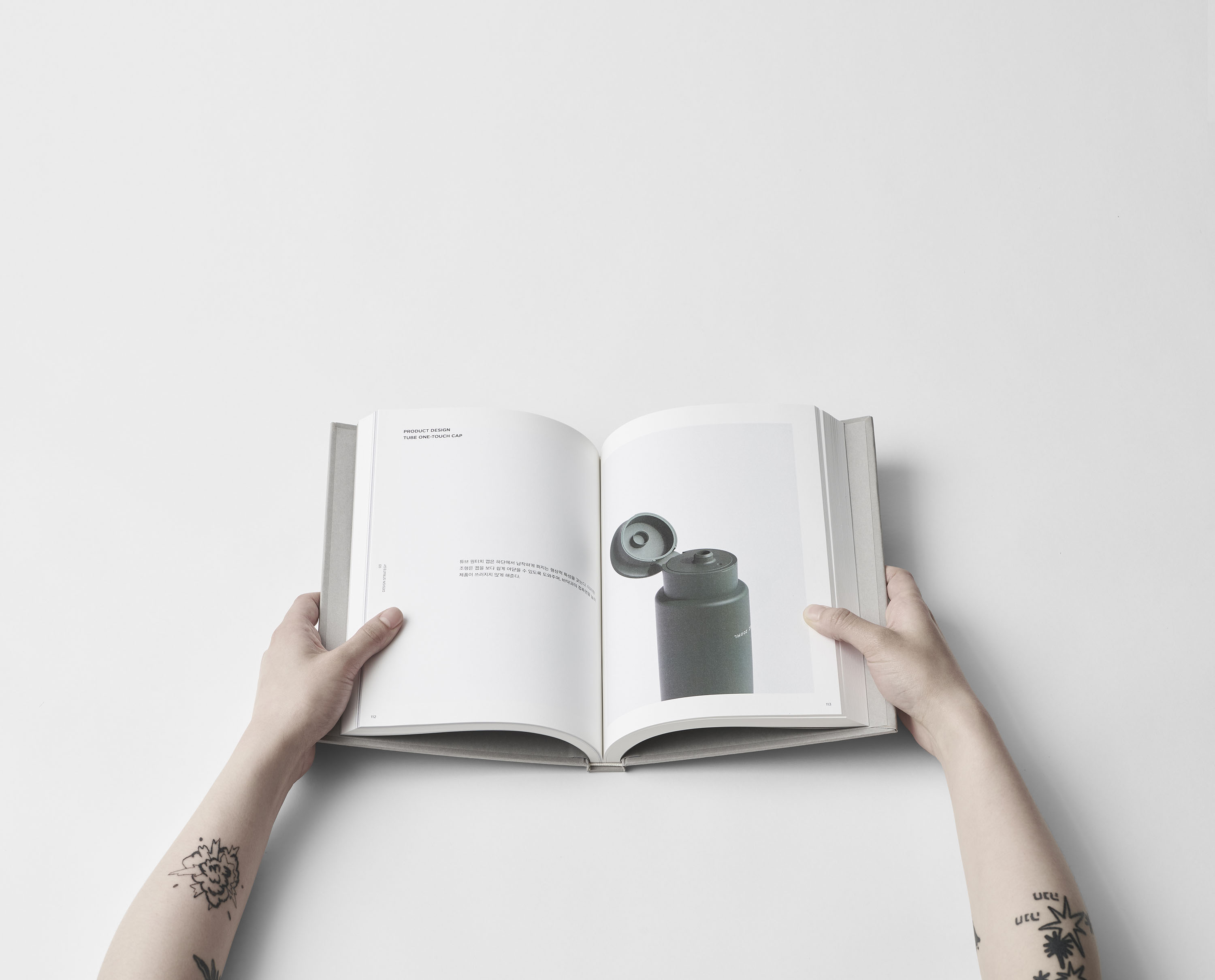
Brand Guide Book
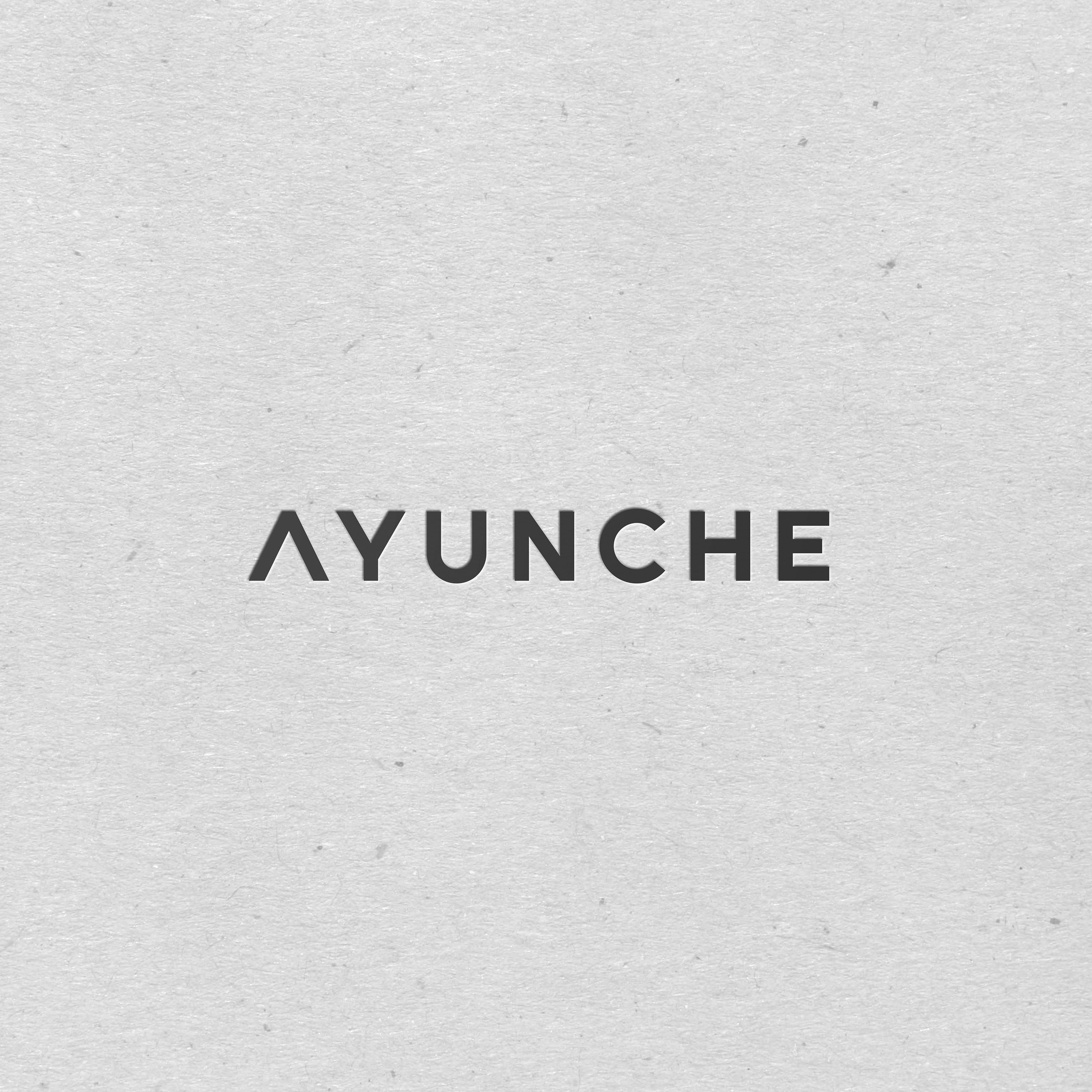
Ayunche Brand Identity Design
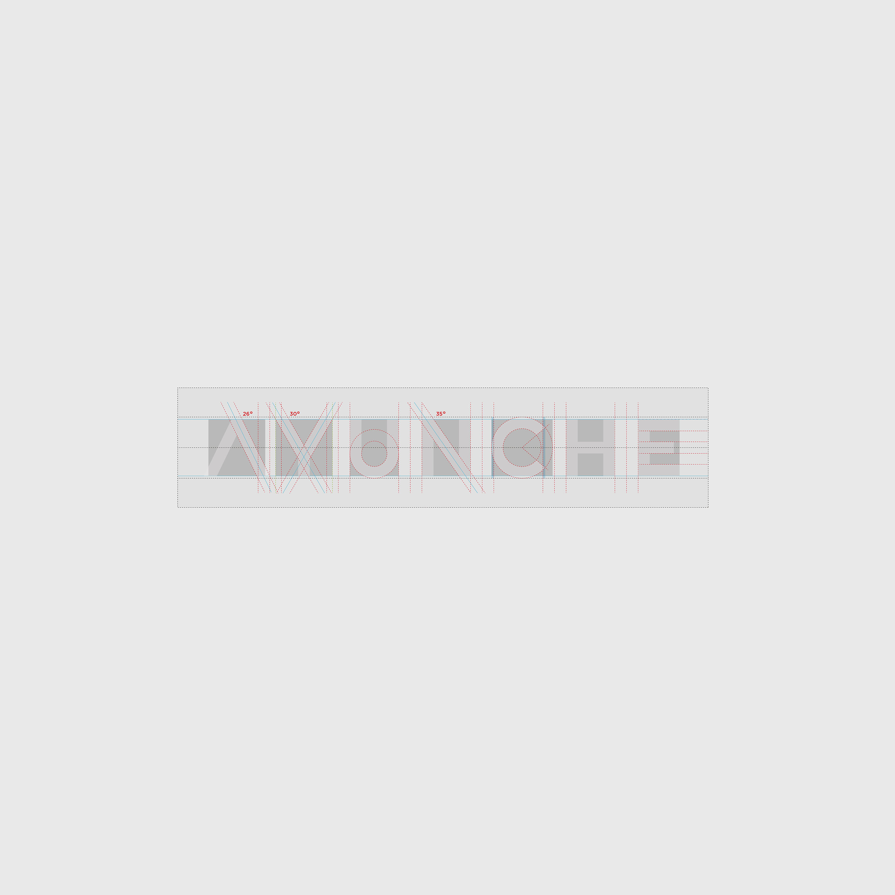
Ayunche Symbol Design

Ayunche Graphic Guide
Process
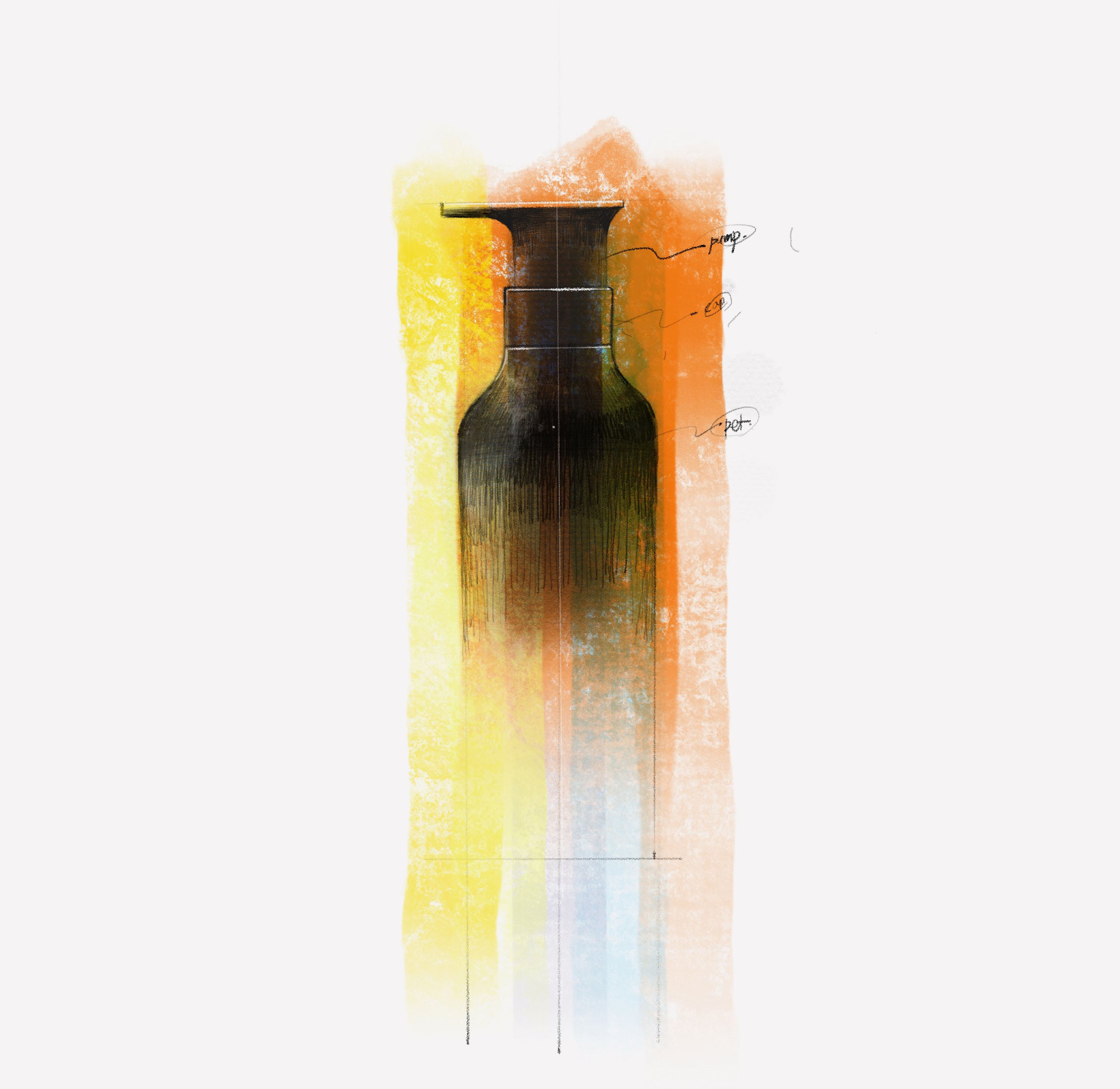
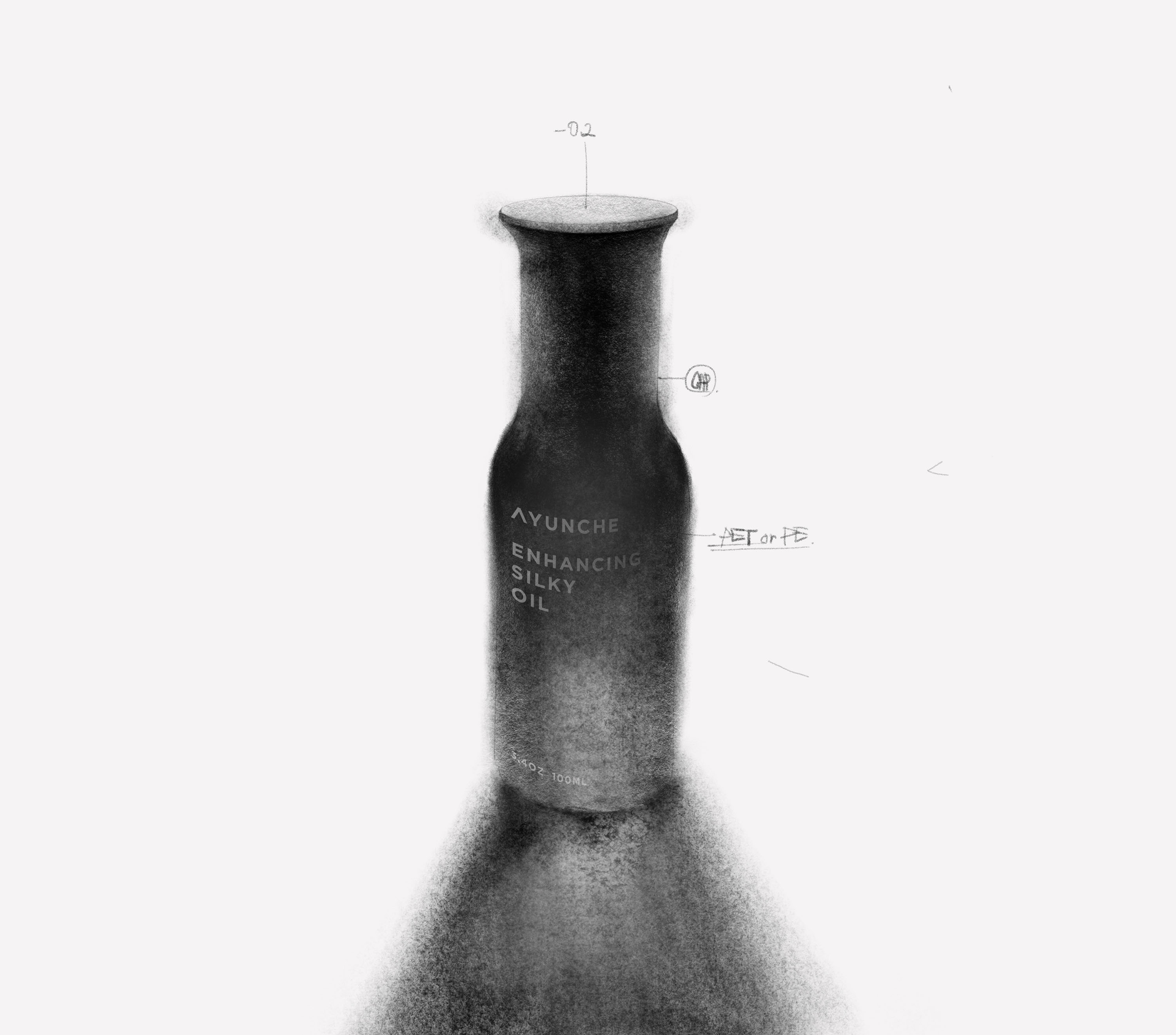
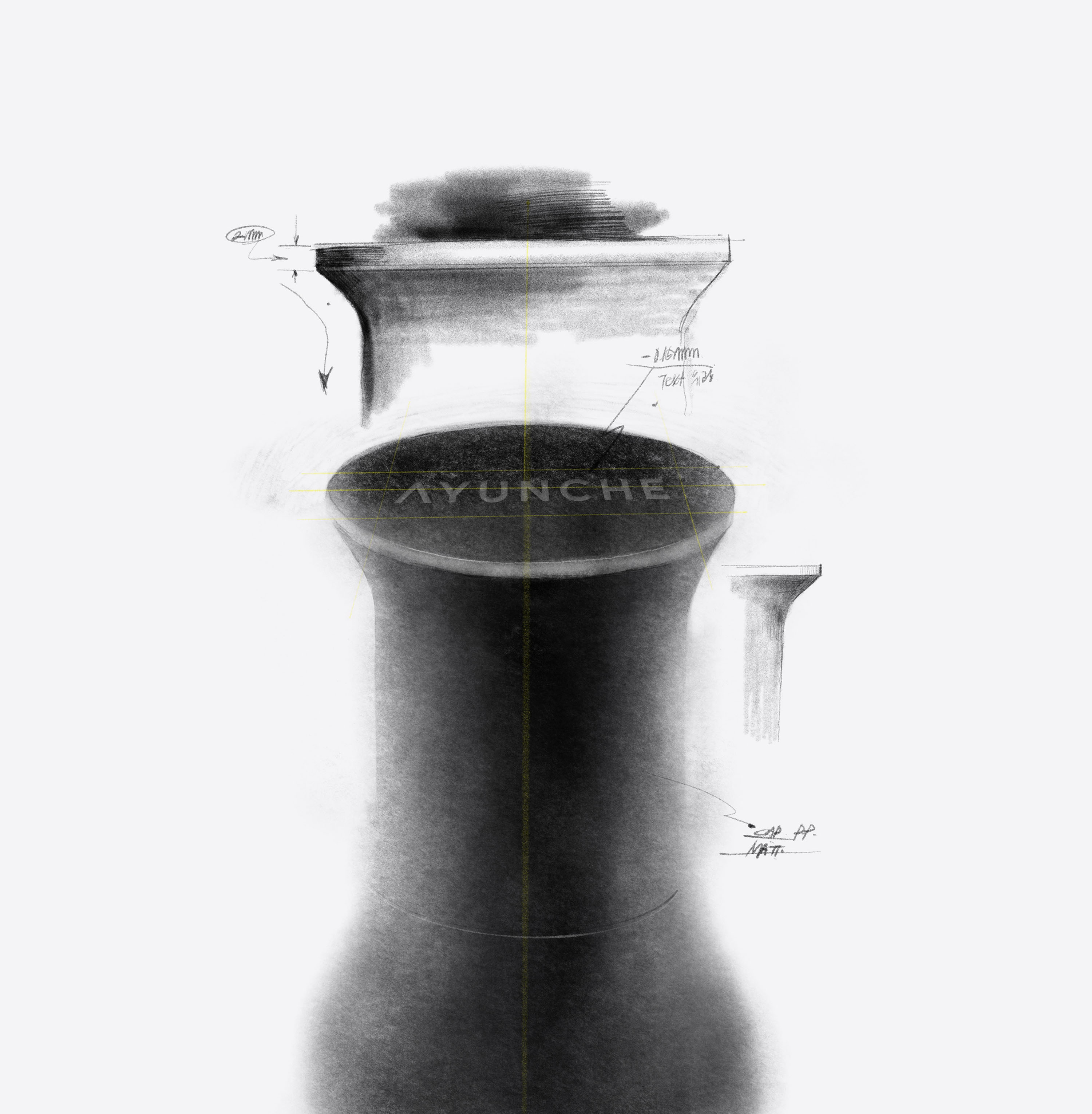
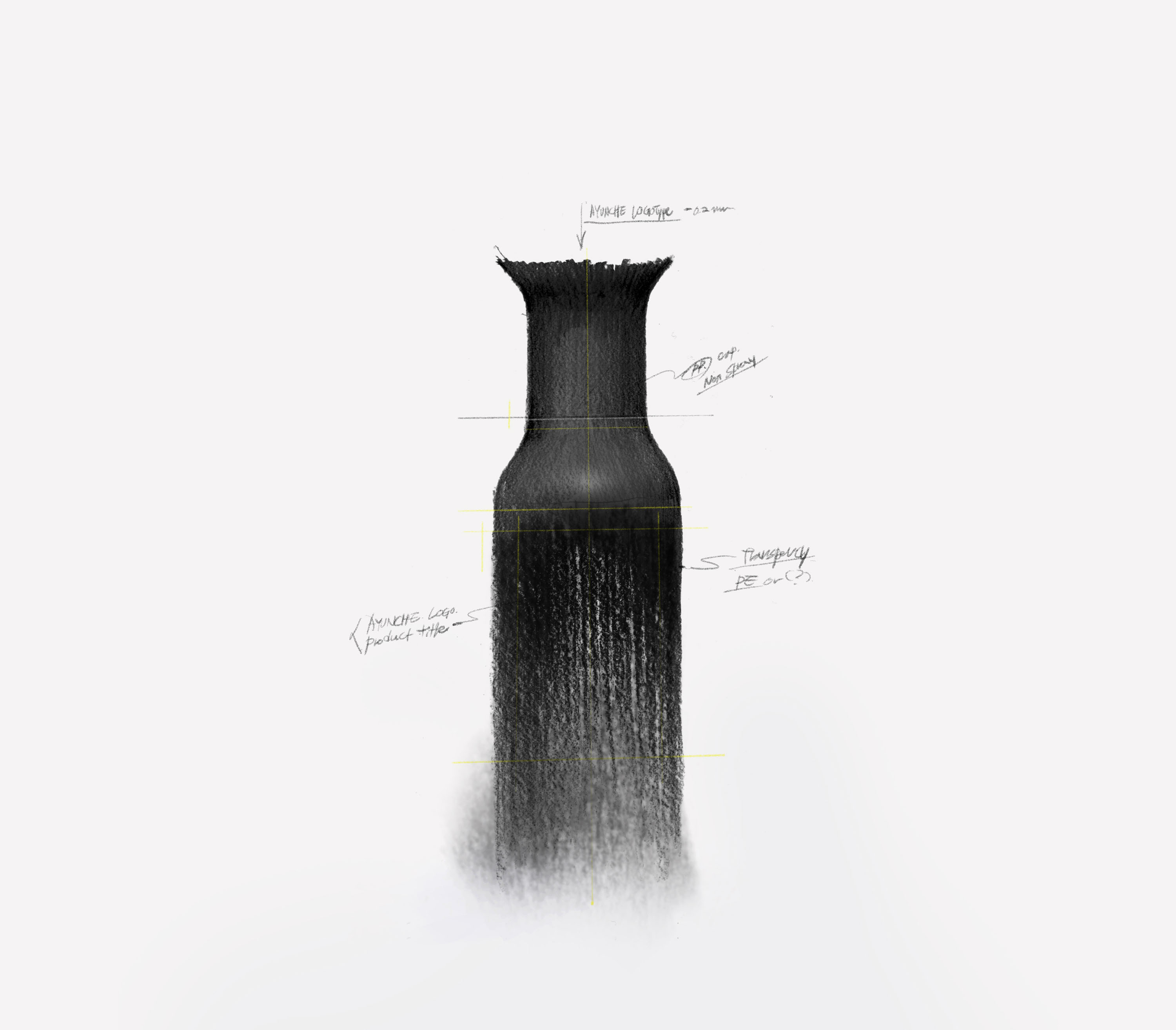
Concept Drawing by Jiyoun Kim